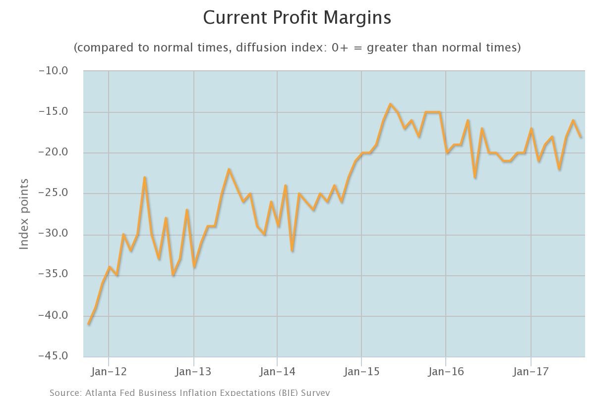
The Atlanta Fed released some surveys which we will look at to get an idea of the direction of the economy in the 6th Federal Reserve district which includes Mississippi, Florida, Georgia, Alabama, Louisiana, and Tennessee. The headline survey was about inflation, but there’s not much to discuss with that because the survey hasn’t shown much range since it was started in October 2011. The highest unit cost growth expected in the net year has been 2.1% and the lowest has been 1.7%. The August survey showed 1.9% which doesn’t tell us much. The chart below is much more interesting. It shows the profit margins diffusion index. The index fell 2 points from July to -18.0. This chart is inconsistent with the record corporate profit margins we are seeing in the S&P 500. It is consistent with the declining profit margins we have seen from the small cap firms and small businesses. As you can see, the peak occurred in 2015 just like the S&P 600 (small caps). It shows that the Atlanta Fed’s district is consistent with the country’s small cap margins.
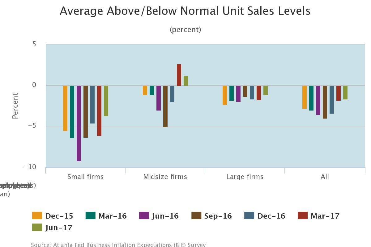
As you can see from the chart below, the small firms are bringing down the overall sales growth. The chart shows the results of firms’ sales compared to normal. Only slightly more large firms are seeing sales declines than sales gains. Midsized firms have more firms with sales better than average, while small businesses remain in the negative as more firms are seeing sales below normal. This survey is part of the question group which rotates, so the data isn’t as consistent.
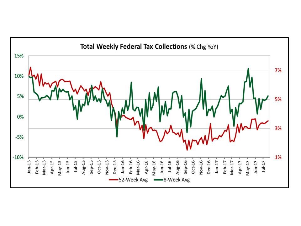
In previous articles I’ve discussed the weekly tax credit, but the data isn’t smoothed like the chart below. As you can see, the red line shows the 52-week average tax collections and the green line shows the 8-week average. It gives you a better feel for the data because it is very volatile. Raw data without seasonal adjustments is tough to visualize. You can even see how volatile the data is when looking at the averages. If you were to put a trendline on the data below, you would see a clear bottom in 2016 as the economy has recovered. The way I look at tax collections is that if it shows year over year growth, the economy is likely healthy; if it shows a contraction, it is probably an inconsistency in the data because of a one-time event, but it’s important to stay vigilant because it could be an early recession warning.
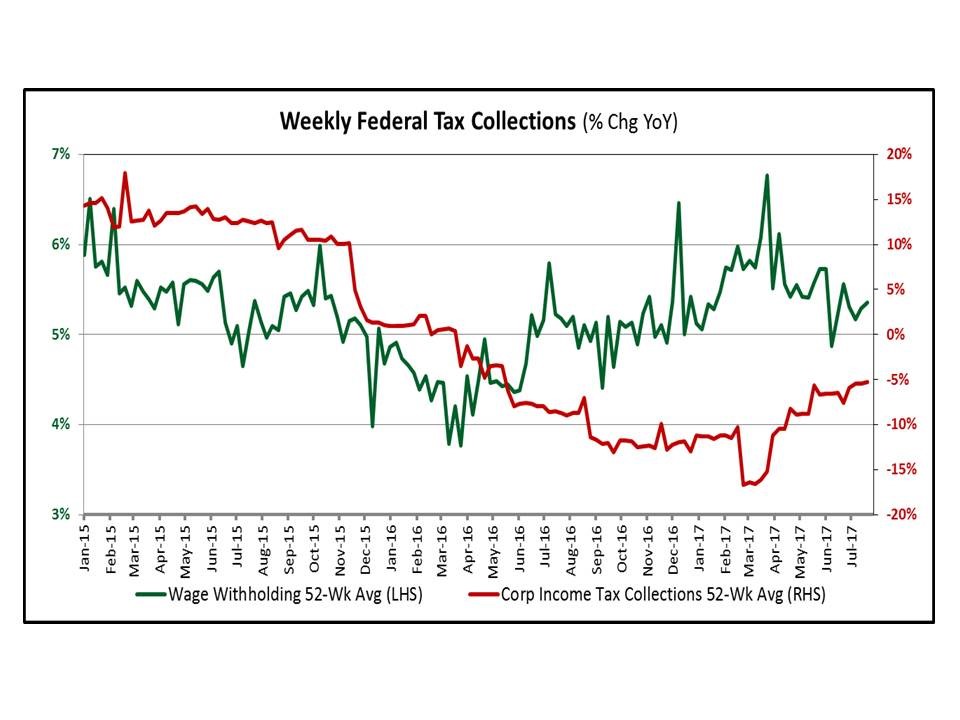
The chart below breaks down the origin of the tax collections. As you can see, wage collection growth slowed by about a third from 2015 to 2016. It’s interesting to see this growth slowing despite the declining unemployment rate. This shows how the unemployment rate isn’t a great measure of the economy as it is slow to react. Some look at the rate of change in the unemployment rate, but I’d rather look at stats like this because it shows how many jobs are being created and the wage growth. The corporate taxes collected has been declining since 2016. The decline has moderated, but it’s still showing a year over year decline. It’s lapping weakness and still not showing growth. Obviously profit growth has been improving in the S&P 500. This metric isn’t denying the strength. The way I view this chart is that some of the improvements in profits are coming from corporations paying a lower tax rate. In order to make more profits and pay less taxes, the tax rate needs to fall. Some energy firms probably used their losses in 2016 to pay less taxes in 2017.
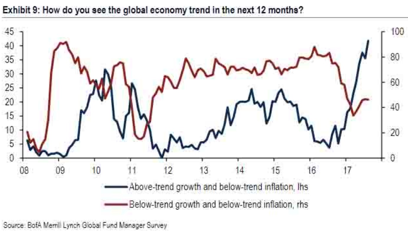
The chart below is from the Bank of America Merrill Lynch fund managers’ survey. It’s unique because I like to go with what they are saying opposed to the consumer confidence index which I like to fade. Consumers feel the best when the labor market is the strongest, but it’s often time to sell when the labor market is getting overheated. I agree with the chart below showing above trend growth in the next 12 months if the central bank doesn’t screw anything up. Keep in mind, the survey question included below trend inflation for both options. That is the nirvana for stocks as the economy grows without overheating.
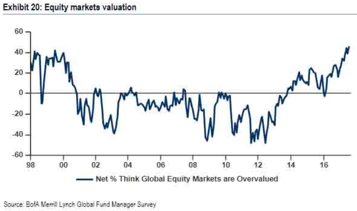
What makes the chart above even more interesting is that the percentage of investors who think global equity markets are overvalued is near the peak in the late-1990s. This is what makes the current market so confounding. The economy is now rebounding, but stocks are expensive. Do you take the plunge, hoping you can time the economic peak or do you not buy stocks because they are overvalued? This tough question is why stocks have rallied so much. When the question is tough, there’s usually a big move in one direction when the results come out. This situation has occurred because stocks started this rally above the median Shiller PE and this recovery has been much longer than average. It’s an interesting question to determine if stocks can crash if everyone believes it is overvalued. This factor isn’t coming out of surprise like the 2008 housing bust which fooled many. Maybe we need to build more complacency.
Conclusion
I’m not saying stocks are a buy when I describe the potential economic improvements signaled by the rebound in global trade. The economy is strong and stocks are expensive. If you’ve planning on holding for multiple cycles or you need the money within a few years, you shouldn’t have much money in stocks. However, if the global economy accelerates, stocks will rise. We could see a situation where in 2018 the U.S. market underperforms because it is expensive. However, a rising tide lifts all ships which means you wouldn’t want to sell your stocks because of the possibility of U.S. stocks only rising 5% next year. The other possibility would be stocks falling on valuation causing an economic slowdown which is the reflexivity theory.