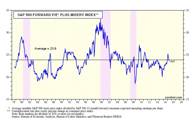
Just because valuation is important as a predictor of future results, that doesn’t mean there’s only one way of doing it. Investing is an art and a science. If it was just a science, everyone could predict where it was going so everyone’s returns would match. Obviously, cash flaws and earnings are the best way to value stocks, but since valuations aren’t a constant clearly there are other factors which move stocks even over many years. The goal for some investors is to outperform the market when it’s up and down. The chart below is one example of an alternative valuation method as it uses the forward PE along with the misery index.
The misery index measures the unemployment rate and the CPI. Because the fundamentals of the economy are strong i.e. low inflation and low unemployment, this indicator shows stocks can be bought now. Unemployment and inflation can quickly rise which makes this chart a timing device combined with a long-term prediction. A weakening labor market and higher inflation are the two aspects which can lead us out of this market nirvana. The problem with this chart is it doesn’t predict when that will occur. I think we’ll see a blip up in inflation at the end of the year. The main question is if it will be enough to spook the market.
I’d like to quickly mention that the stock market fell on Tuesday because of the threats made by North Korea to bomb the America territory Guam. There’s not much I can add to this story as we don’t know what to make of it. Any serious action would cause stock multiples to fall, gold to rise, and the dollar to rise. Gold caught a bid at the end of the day as stocks sold off; gold was up 0.63%. I was expecting August to be a quiet month. This story is probably the market’s biggest worry for the next few weeks. I’ll discuss it in more depth if it starts to effect stocks more in the next few days/weeks.
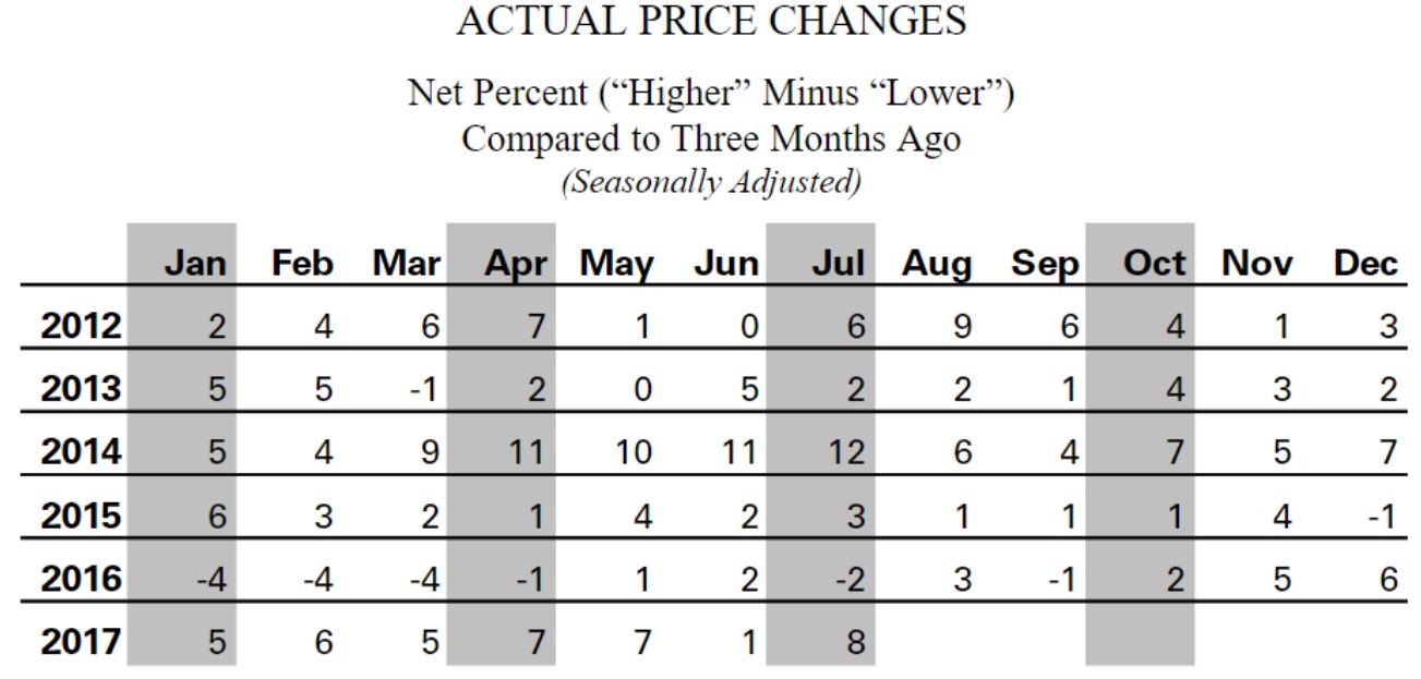
Getting back to the small business survey which I was reviewing in a previous article, the chart below shows the price changes. Looking at the 3-month changes opposed to the year over year changes eliminates base effects which gives you a better idea of the trend. For example, oil fell at this time last year which will help year over year inflation. However, that’s not an aspect which tells you much about the current economy. As you can see from the chart below, the prices paid index increased to 8 from 1, making a year high. This chart captures the weakness in prices in 2015 as the CPI was flat and this index was in the low single digits. It has a moderate disagreement in 2016 as there was a spike in the CPI while this index fell.
There has been a sharp divergence in the past few months outside of June as the CPI has decelerated while this index has increased. The Fed is looking for a reason to raise rates because of rising prices; small business is one of the categories seeing some price improvements. Besides improvements in actual prices, the price plans index, which measures the anticipated changes in prices over the next 3 months, increased to 23. That’s the highest report since December 2016; it’s the second highest figure since 2012. This signals some more inflation coming from small businesses is to be expected.
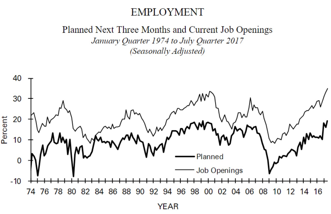
The chart below is one I have shown many times. The first takeaway from this chart is that there is a skills gap which is preventing the number of hires from catching up to the number of openings. The second is that wages will be increased to chase after workers in this tight labor market. The updated figures show the gap widening as the job openings index went up 5 ticks and the hiring plans went up 4 ticks. Giving us more details on the skills gap is the survey which tells us the number of businesses which have few or no qualified applicants for job openings. That index hit 52 which is the highest reading since 2012. I think the gap in the chart below and the number of jobs which don’t have qualified workers tend to increase when the labor market is close to the end of the cycle. This appears to be the case before the prior two recessions. This chart implies a recession is probably coming in the next 2 years.
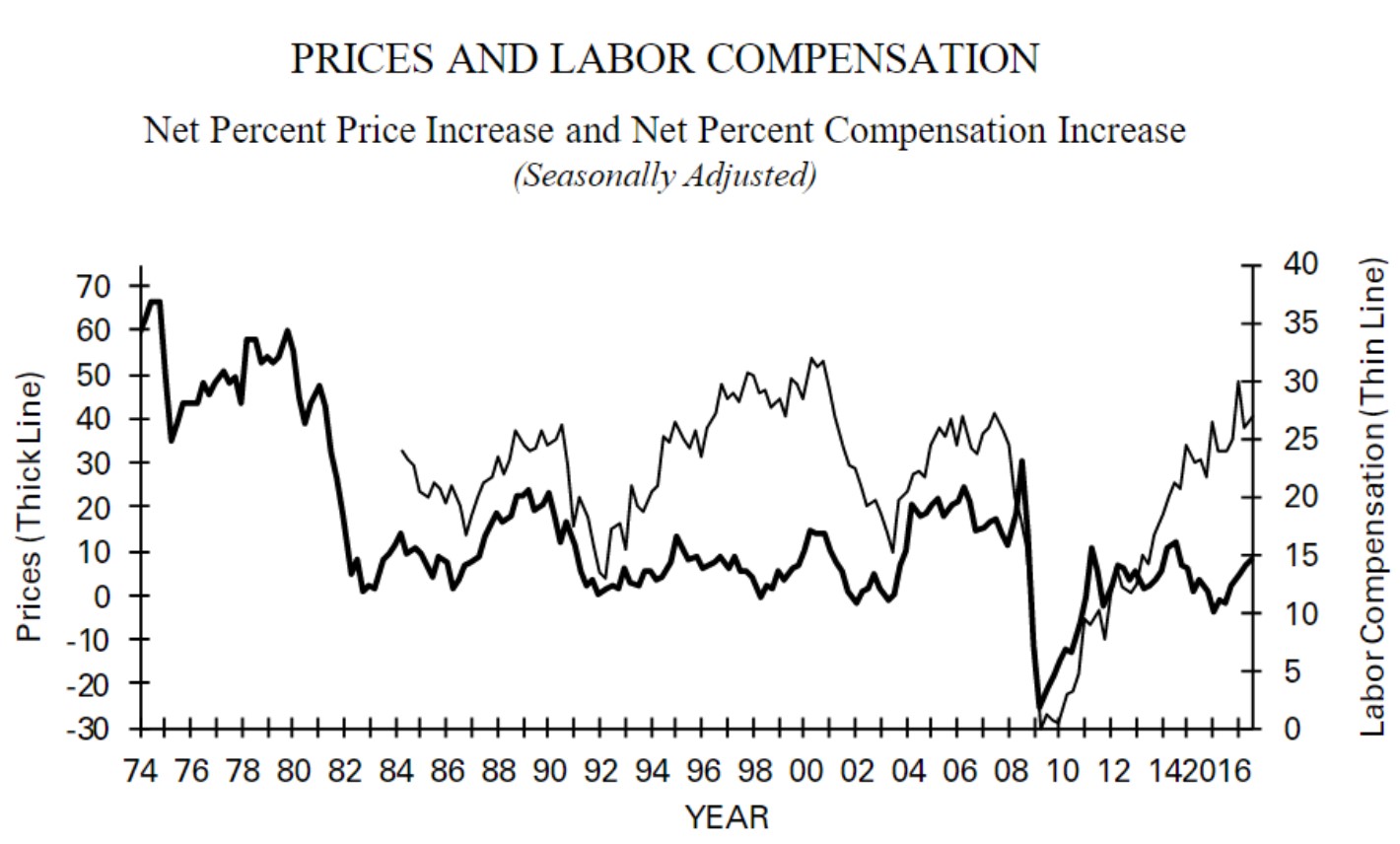
The chart below supports my estimation of a recession coming shortly because the net labor compensation increases this cycle are on par with the increases last cycle and slightly lower than the early 2000s cycle. This chart does a great job at highlighting how wages have been increasing, but prices haven’t. That’s a nirvana situation for stocks because low inflation allows for low rates as the labor market stays tight, but doesn’t push it much higher. This chart supports what Neel Kashkari promotes as he wants to keep rates low to allow wages to rise since inflation is low. Wage growth should accelerate in the next few months and start to pressure the inflation numbers finally. The wild card is what the central bank unwind does to prices.
Conclusion
We looked at most of the small business survey. There are a few more charts we will review in the next article. It’s fair to say the small business economy is on strong footing. The main question is how long this period lasts. The low misery index certainly helps them and boosts stock multiples. We’re at the average valuation when you consider inflation and unemployment. Obviously, the North Korea issue can spur volatility. It’s an unanalyzable situation because we don’t know how leaders will react and how the market will be affected by their stances. It will probably dominate the headlines for the next few weeks. However, it’s not something I would consider selling my stocks over.