Worst Decline In 2 Years
With the S&P 500 falling 2.37% in the past two trading days, February closed with a whimper. Sometimes new money flows in on the first day of the month, so we’ll see how that plays out on Thursday. As you can see from the chart below, February was down 3.24% which was the worst performance since January 2016. It seems like the decline in January was catalyzed by economic weakness while this latest set back was caused by optimism getting out of hand. It’s an important comparison because, by understanding how much better the fundamentals are now, it makes it clearer that this is just a correction.
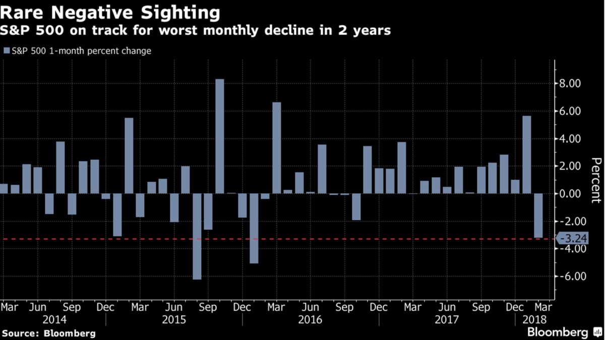
The biggest divergence between the two situations is that S&P 500 earnings had peaked in 2014, while they are at a record now. That 2016 decline was towards the end of the mini-downturn as the emerging market weakness and energy weakness took its tole on the overall market. Now we have record earnings, rising oil prices, and a rebounding global economy.
On the other hand, according to the Shiller PE, the stock market is much more expensive now. The Shiller PE was 24 on February 1st, 2016 while it’s at 32.83 now. The forward PE was about 15 in January 2016 and now it’s 17.1. You’re getting a more expensive market now with stronger fundamentals and much more investor optimism even after the correction. During the January 2016 decline, the bears actually outnumber the bulls.
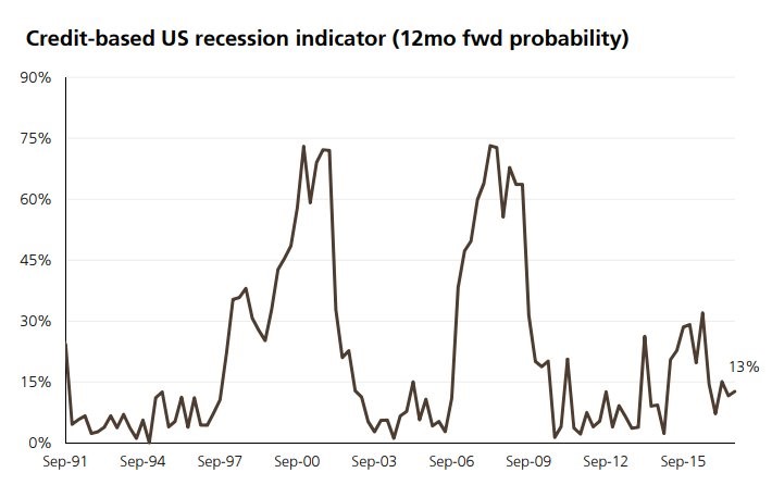
Recession Not In Sight
Furthering the point of how different the economy is now versus January 2016, the chart below shows the odds of a recession based on credit markets. As you can see, the odds are at 13%. It was in the low 30s in January 2016. I’m not saying this is a great forecasting tool because clearly if stocks and bonds act in tandem with the economy, this indicator won’t forecast anything. It will tell you what you see on your screen.
Household Savings Is High
There are countless articles which talk about the consumer debt being out of control. They often look at the total non-mortgage debt. Because the housing debt hasn’t reached the prior cycle high, the bears focus on the record credit card debt, student loans, and auto loans. It’s interesting to note that because of housing debt, consumers were the most leveraged ever heading into the last recession. Household debt to GDP peaked at 99% in Q1 2008. Since the recession, the debt to GDP percentage has fallen. As of Q4 2016, the debt to GDP was 80%. There hasn’t been a rebound in debt to GDP even during the expansion. It’s possible, the debt to GDP falls lower in the next recession.
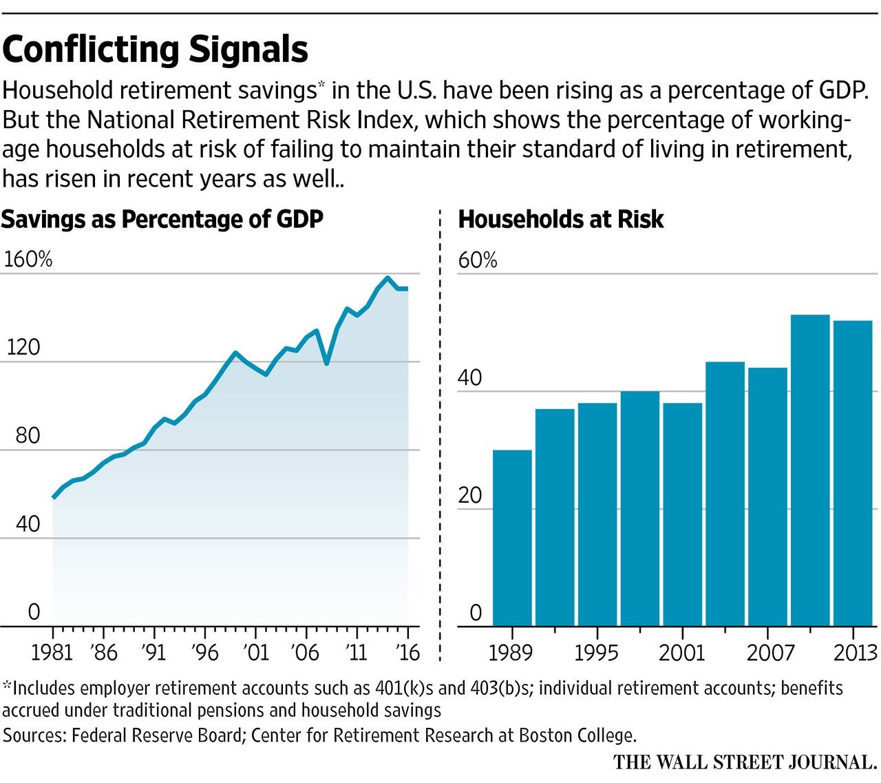
Furthermore, as you can see in the chart on the left, the savings as a percentage of GDP has escalated in the past 40 years. It’s now about 150% of GDP. One of the reasons savings may have increased is because regular people are getting more access to investing products that have been previously only used by the rich. Secondly, the rich are able to get access to better strategies as well.
The 401K plan, where employees can invest without paying taxes until the money is taken out, was first put in legislation in 1978. For the first 2 years, the provision wasn’t used. An interpretation of the law created the first 401K savings plan in 1981. That’s where the chart on the left starts. First, investors put money in mutual funds and more recently low-fee ETFs have become more popular. The advancement of the internet makes capital allocation easier. I’m interested in the possibility of whether this increased savings has been the cause of the Shiller PE being so high in the past 3 decades. Either way, the consumer is actually in pretty good shape. That could clearly change if the labor market is hurt by a recession.
Potential Retirement Crisis
The second chart shows the percentage of households at risk of a standard of living decline during retirement. It’s disconcerting that it increased in the 2000s. However, it’s clearly incomplete data as the latest bar is 2013. In the past 4 years the unemployment rate has fallen from 6.7% to 4.1%. The household assets have also increase remarkable because of the great run in stocks. Millennials are also gaining a reputation for saving more than previous generations, partially due to student loans and partially due to changes in behavior, which makes me less worried about a potential retirement crisis.
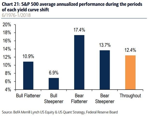
Summary Of Stock Performance With Various Yield Curves
The yield curve is certainly in its flattening stage. I’ve shown charts which explain how stocks do at the end of the flattening stage. That’s fairly simple in that it shows how stocks do at the end of the business cycle. The chart below is much more complex, potentially making it not have value, depending on your analysis. The chart breaks down the performance of the bond market and the change in the shape of the curve. As you know, bonds can flatten or steepen during both bull and bear markets. There’s a sharp divergence in equity performance during each scenario. The best is bear flattener and the worst is bull steepener. It’s extremely tough to figure out both the future shape of the curve and the future bond yields. Even after that, this only gives you a hint of where stocks will go.
However, what this chart does tell you is that stocks do better when the curve flattens and when yields rise. This makes sense. Stocks like growth, so they like when yields increase. Secondly, at the end of the cycle, the yield curve flattens. It usually steepens when the economy goes into a recession as the Fed cuts rates. Therefore, don’t worry about a flattening yield curve. Worry about a steepening curve after an inversion. That’s the final warning sign of an impending recession. The bond market is years away from issuing that warning signal.