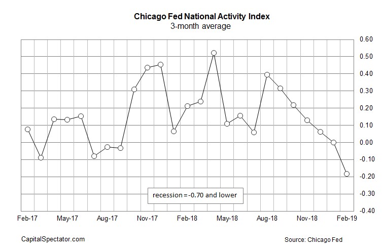
National Activity Index Falls
The February Chicago Fed national activity index should please the bears as it was -0.29. Technically, this index fell from last month because January’s reading was revised from -0.43 to -0.25. Somehow, the 3 month moving average was revised down from 0.16 to 0. Previous reports must have been revised lower.
As you can see from the chart below, the 3 month moving average fell to -0.18. This index consists of 85 economic indicators. When it falls to -0.7 or lower, it’s a recessionary signal.
This is another example of how economic growth is weak, but there are no signs of a recession. Bears like to point out that there were no recessionary signals before the last recession. However, that’s not a fair argument because economic indicators are weak during slowdowns. If you assumed every slowdown would lead to a recession, you would have been incorrect twice since the financial crisis.
The index was weak in February because of the jobs report which showed only 20,000 jobs added. We could easily see that revised higher, pushing this index higher. Employment indicators pulled this index down 0.1 which is down from the 7 basis points it was pushed higher in January.
Production indicators pulled the index down 0.16; personal consumption and housing pulled it down 6 basis points. Sales/orders/inventories was the only positive group as it added 3 basis points. It’s fair to say February wasn’t a great month for the economy. There won’t be many good months in Q1 as estimates are for 1.5% GDP growth.
National Activity - Dot Plots Aren’t Accurate & Neither Is The Market
Fed’s guidance doesn’t accurately predict where rates will be. The Fed’s excuse for this poor track record is that its guidance is used to impact the economy. For example, it can give dovish guidance to calm down a skittish market even if it doesn’t plan on acting on that guidance. Guidance is a first derivative tool of interest rates that’s more powerful than changing rates.
Instead of changing rates often, the Fed just gives speeches to affect the economy. The problem with open mouth policy is it can easily be misconstrued. I’m not writing this article to criticize the Fed though. I’m just explaining how policy works and why the Fed’s dot plot hasn’t reflected reality as the chart on top shows.
Who knows if the Fed would accurately predict policy if it didn’t use guidance as a tool. But we can’t act as if the Fed’s guidance has no impact on the economy. After guidance effects the economy, the Fed must adjust policy, making previous dot plots look incorrect.
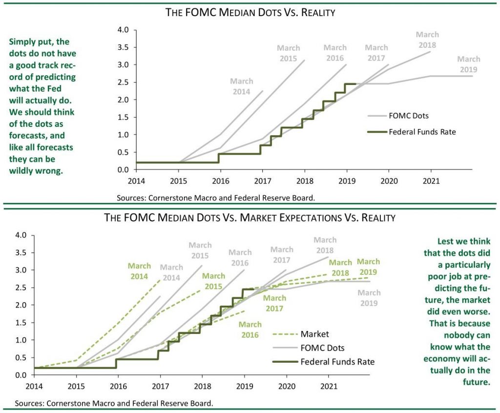
The bottom chart shows the Fed funds futures market versus the dot plots and reality. Fed funds futures market has a worse track record than the Fed even though the Fed uses guidance in making policy. And, Fed guidance partially reacts to the futures market, the economy, and the stock market. If the futures market shows a high level of certainty of an action. But the Fed knows it won’t take that action, the Fed will immediately give policy speeches with strong rhetoric.
National Activity - A main takeaway is you can’t assume the Fed will cut rates in 2019 just because the market is pricing that in.
Personally, I’m amazed at how people are taking the Fed funds futures market at face value. It's has been consistently wrong. Investors don’t think the Fed will cut rates this year because we expect the economy to avoid a recession. It’s possible for the Fed to cut rates in a slowdown. But that’s not how it has reacted to previous ones.
Fed could alter its guidance in the dovish direction at its next meeting. By the time it would get ready to cut rates in the following meeting, the economy could be showing signs of recovering.
To be clear, when we say the economy will recover later this year, that’s a base case scenario. I’m not bullish on stocks because the rally means stocks are already pricing a recovery in. However, it’s not a certainty. I’d be more optimistic on stocks if they were lower.
National Activity - Recession Odds
The chart below shows the probability of a recession based on the 2 year 10 year bond yield spread. When the difference is at 12 basis points, the chance of a recession is 48%. It’s important to distinguish between when the curve is flattening and when it is steepening.
The curve implies there will be a recession in the intermediate term when it is flattening towards a recession. After inverting, when it steepens, the curve implies the economy will enter a recession in the near term or that the economy is already in a recession.

Bottom chart shows the likelihood of a recession based on each spread. It’s interesting how an inversion of 10 basis points has historically led to a recession 99.5% of the time. I get worried when I see this analysis. It gives flashbacks of charts that showed the percentage chance of a recession based on the length of the cycle.
Recessions have almost always happened by now because this is about to be the longest expansion since the 1800s. Thinking there needs to be a recession after a certain length of time hasn’t worked out as this expansion has continued.
It’s imperative to combine the yield curve with other data. For example, you can look at the leading indicators and the ECRI leading index. Also, it’s not as simple as saying there is a guaranteed recession in one year if the curve inverts.
National Activity - Conclusion
Chicago Fed national activity index is disconcerting, but also doesn’t give us new information. It summarizes the economic data in a digestible format just like the Nowcast GDP estimates I review.
The yield curve inversion is something to monitor rather than a metric you must follow regardless of what anything else says. Even though the yield curve inversion hurts banks, it might not lead to a recession because of how gradual the flattening was. This was an anticlimactic inversion.