Delinquencies Versus Jobless Claims
The charts below are interesting, but I think they ultimately provide a falsely negative result. I’ve never seen the delinquency rates being compared to the initial jobless claims, so I think it’s worth taking a look at this. The problem with this calculation is that the jobless claims have been extremely low. The claims were 222,000 as of the May 12th week. That was up 11,000 from the previous week, but we’re still near the lowest ratio of jobless claims to labor force population ever. This chart penalizes good jobless claims results. This indicator should be biased to the positive side because the jobless claims should go up as the labor force grows if the chart doesn’t adjust for that increase. We’re in a rare case where this indicator is negatively biased.
The problem for the chart creators here is that if you included the labor force to jobless claims ratio, the situation would look much worse. It’s not really believable to claim this year is worse than the peak of the financial crisis. I think it would interesting to adjust the delinquency rate on loans for economic growth such as GDP or consumer spending to see if the delinquency rate is higher than it should be. Ultimately, the best way to calculate the stress in the debt market is to just look at the delinquency rate.

There’s no need to use a formula that’s more complicated than it should be predict the next period of economic stress. This chart takes an interesting idea and tortures the great metrics to make it look like the consumer is stretched. The delinquency rate on loans is actually down as the 90+ day rate went from 11% to 10.7% on student loans which was the best since Q2 2012. To be clear, the results in these charts are 30+ day delinquency rates, but comparing apples to apples makes the results similar. The mortgage 90+ day delinquency rate is 1.2% which is why even the tortured chart shows we’re are in a strong economic adjusted performance period. The auto delinquencies are off the chart in this calculation. The results are getting disconcerting, but there’s no way the situation is worse than 2010. The delinquency rate is 4.3% which is the highest since Q3 2012.
The credit card default rate looks worrisome as the rate increased from 7.6% to 8%. As expected, this pushed the category into the weak section. Overall, it’s clear that some portions of consumer debt are doing poorly and others are improving. The total sum of delinquencies improved marginally which is great because there’s not much room for improvement. The same can be said about the jobless claims although I think the report underestimates the slack in the labor market. Previously, the claims to labor force ratio had been a signal to sell stocks, but that hasn’t worked out this time because of the slack being worked off.
Google Trends Data Might Not be Accurate
Another data point which I find to be potentially wrong is anything related to Google trends. I used to look at them seriously when they first started being reported few years ago. Since then, I’ve learned to discount their credibility. There could be many reasons why people search for a specific topic. Also, the older the data, the less users contributed to it as Google was a much smaller website 10 years ago as less people were on the internet. The chart below shows the Google search trends for terms like default, chapter 7, and bankruptcy. There was a big boost in these searches recently. If you look at the recent Federal Reserve Report on the Well-Being of the U.S. Households, the consumer is actually improving. That report is from 2017 and this data is from 2018, but the difference is still valuable to know. The veracity of economic reports improves as they get older. The reports on the leading edge like this have a lot of examples where there are false red flags.
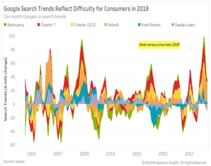
The Google searches for distress improved at the very edge of the data set, but the searches for loans have kept up their weak pace. The key problem with new reports like this is they utilize the fact that they were correct in 2008, which was the last recession, to make it look like they accurately raise red flags. The problem is most data points were negative in 2008 because the economy was so bad. Even a faulty reading will likely show negativity. As you can see, the trends for consumer spending were positive in 2016 even though the economy almost went into a recession. The consumer was definitely weak in Q1, but I think that will change soon in Q2.
New Home Sales
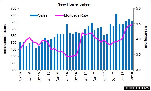
Let’s switch gears and look at relevant economic data on new homes sales. The latest report was 662,000 which, missed expectations for 677,000. As you can see from the chart below, the general trajectory is positive even as mortgage rates have increased. The sales were up 11.6% year over year. At some point, high mortgage rates will affect demand, but we aren’t there yet. Helping demand is the fact that pricing was weak as median prices were down 6.9% month over month and only up 0.4% year over year. The biggest impediment to sales growth is actually a lack of supply. New homes to the market were up 2,000 to 300,000. Supply relative to sales was up marginally from 5.3 months to 5.4 months.
Conclusion
Most of investing is eliminating false arguments like the ones I presented in this article. You need to be like an editor who eliminates the bad ideas. There are always charts which show bullish and bearish arguments. Sometimes both have valid points, but often there are charts with false pretenses going up against ones which are valid. It makes sense to be skeptical of charts that are new ways of looking at the economy because often times they have an agenda instead of being intellectually honest.