Russell 2000 Hits A New All-Time High
The stock market reversed most of Tuesday’s decline as the S&P 500 was up 0.41% on Wednesday. It was a big day for the Russell 2000 as it hit a new record as it was up 1%. Some say the small caps can be leading indicators for the S&P 500. Here’s an odd stat. Since 2013 when it has taken the Russell 2000 3 months to make a new all-time high, the S&P 500 made a new high within the next 3 months 4 out of 4 occurrences. I will file that as a highly specific stat which may or may not come true again. It’s certainly not outlandish to think the S&P 500 will make new highs in 3 months as that would be a 5.5% rally. If economic growth improves as expected, stocks will rally, potentially adding to that stat.
Besides being a leading indicator, the Russell 2000 rally can mean the American economy is outperforming other advanced economies. The strong dollar favors the Russell 2000 over the S&P 500 which might mean the S&P 500 won’t make new highs soon. The dollar index was down marginally on Wednesday, but it’s up 4.75% in the past 3 months. This dollar rally makes the rally in oil even more impressive. As per usual, oil was up on the same day stocks were up. WTI was up 18 cents to $71.49 which is a 3.5 year high. Brent is closing in on the $80 level.
10 Year Yield Goes Up Again
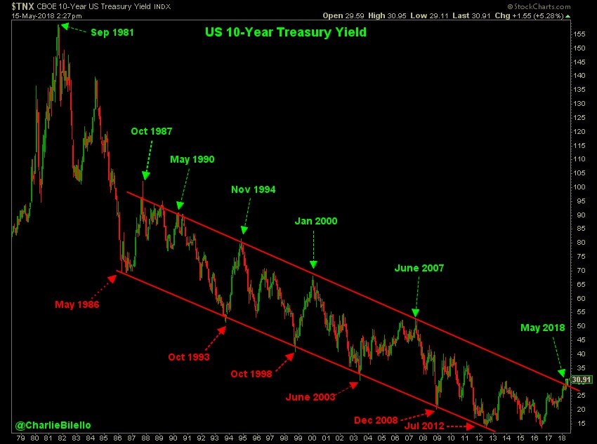
Even though oil is at a 3.5 year high and the Russell hit a record high, the biggest news on the day was the 10 year yield hit the highest point since 2011 as it rose to 3.0945%. The chart below shows the downtrend range which has been in place for 32 years. As you can see, it has broken out of the top end of the range. Some of the dates on the list of tops are ominous as October 1987 saw a major correction, January 2000 was 2 months before the peak of the tech bubble, and June 2007 was 4 months before the peak of the market before the mortgage crisis hit. I don’t think history will repeat itself as there’s not much to justify a major correction or crash this year.
The deficit spending to create growth has pushed up the 10 year bond yield and growth. That’s not a recipe for a crash. The interesting dynamic at play is that without the fiscal stimulus, America might be in the same poor shape as Europe, but the 10 year yield would also be lower. In other words, without the tax cuts and omnibus spending deal, America could be closer to a recession, but the indicator here wouldn’t have been flagged as the 10 year yield would be lower.
What Yield On The 10 Year Will Cause A Bear Market
The 2 year yield increased to 2.59%. Because the 10 year yield was up more, the difference between the 10 year and the 2 year yield is 51 basis points. It’s funny how after the close on Tuesday, I stated that the headlines claiming the rising yields caused the stock market decline would be gone the moment stocks rallied while yields went up and that occurred on Wednesday. I have been discussing at what point the rise in yields will cause stocks to decline. The good news is that the PE multiple has already declined, so there’s less of a risk of a correction if yields rise further. There’s no magic percentage which is the tipping point for stocks. I think it depends on if inflation or economic growth is causing rates to go up. If inflation were to soar and yields went up, I’d be nervous. If GDP growth is 4% in Q2 and the 10 year hits 3.5%, I won’t become bearish.
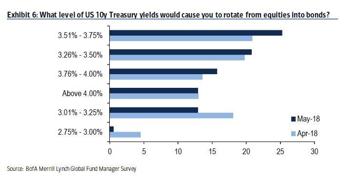
The chart below is amazing for two reasons. Firstly, it’s interesting to see what rates would cause investors to shift from stocks to bonds. Since we don’t know the level, any clues can help. As you can see, there would be a big shift in capital if the 10 year yield was between 3.26% and 3.50%. If there was a shift, yields would come down and then money would flow back to stocks. An equilibrium would need to form. The second reason it’s amazing is that the poll shifted from April to May as yields increased. Investors who claimed they would shift from stocks to bonds if yields rose, quickly backed away from that decision. The percentage who said they’d sell stocks if the 10 year yield was between 3.01% and 3.25% fell from about 18% to about 14%. We haven’t seen much selling yet with the 10 year at 3.09%. The only selling has been the short selling in the 10 year bond futures.
10 Year Yield Too High?
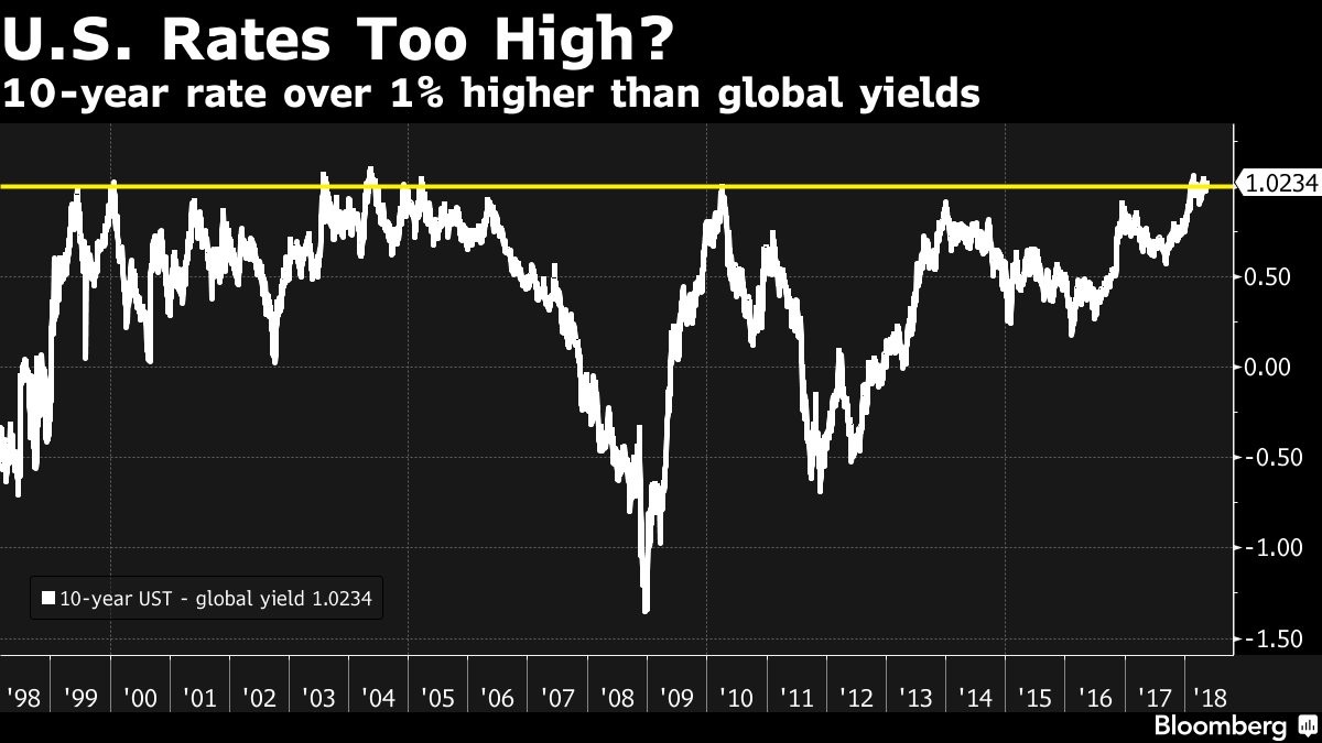
The chart below is even more remarkable than the downtrend chart I showed earlier. As you can see, the chart compares the 10 year treasury to the global 10 year yield. Since the late 1990s, the peak has been 1%, meaning the 10 year treasury yield is 1% higher than the global 10 year yield. The fiscal policy stimulus is causing the American economy to outperform the global economy by a historicallysignificant amount. This chart title implies the 10 year yield will come down or global yields will rise, but I think the current situation is justified by the fundamentals. Just because the 1% mark has been a ceiling for yields before, doesn’t mean the ceiling will remain.
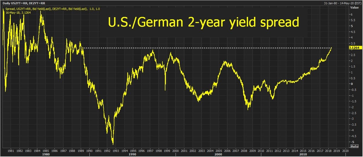
Fed Much More Hawkish Than ECB
The 2 year U.S. treasury is 3.12% greater than the German 2 year yield. That’s the greatest spread since March 1989 or before the Berlin Wall fell. This shows how the U.S. monetary policy is historically hawkish compared to the ECB. This chart even goes back before the E.U. was founded in 1993. That’s what happens when U.S. core CPI is 2.1% and E.U. core inflation is 0.7%.