Correction Has Gotten To Extreme Levels
Review of the ‘risk off’ trade in the past few days has been interesting because it has gotten remarkably extreme in some ways for such a normal correction. I remain in the camp that believes the fundamentals are sound. Growth is slowing, but that only justifies a correction opposed to a bear market. Since the correction has occurred, it’s time to be a bull.
Your perspective is dependent on your time horizon. If you’re a short term investor, I think you should’ve went short the market in January and should be heavily long now. If you’re a long term investor, then you recognize this is the 4th slowdown in this expansion. None of the previous slowdowns justified making a big move. Long term investors have enjoyed riding the bull wave instead of trying to time each movement. There will be a time to lighten up the long positioning in a long term portfolio, but we’re not there yet. The economy hasn’t fallen off a cliff and earnings growth is amazing.
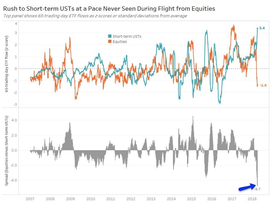
Excessive Buying In Short Term Treasuries
The most interesting charts are the ones which show extreme movements despite the fact that this has been a normal correction. The vacillations have been excessive this year, but a 10.5% decline isn’t out of the ordinary. The chart below is an example of one which is at record levels. As you can see, it shows the z-score of the ‘risk off’ trade as investors sell stocks and buy short term treasuries. The difference is 4.7 which is by far the biggest difference since 2007. The decline in stocks is similar to other selloffs, but the buying of short term U.S. treasuries is the most in this period. It might be because investors are betting that the short term yields will fall because the Fed will slow down its rate hikes since the economy is slowing. I still think the Fed will raise rates 2-3 times, but the expectations for rate hikes have shifted to the downside. This is a chart you want to fade since the action is probably unsustainable.
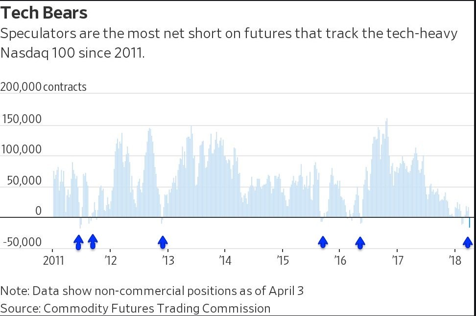
Nasdaq Shows The Shorts Have Taken Control
Tech has been at the center of the recent declines. It is falling because the momentum leaders which have a high beta usually fall the hardest during declines as traders take profits. You often see these stocks down 15% or more, yet they’re still up in the past year. For example, peak to trough, Facebook fell 21%, but was still up 3% in the previous 11 months. The losses are high in percentage terms, but not in the length of time since that price was last reached. The chart below shows another example of how the market has triggered an oversold red flag. This shows the net short futures in the Nasdaq 100 have reached the highest level since 2011. The blue arrows show when the speculators have been net short the Nasdaq 100. It hasn’t been a common occurrence as the Nasdaq has beat its previous record high in 2000 this cycle. As you can see, usually after the shorts gain control, they lose it soon afterwards as the bull regains momentum.
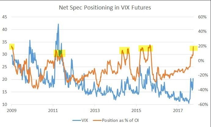
Speculation In VIX Futures Is High
The chart below shows the VIX along with the net speculative position as a percentage of open interest. Even though the VIX isn’t as high as it has been in previous volatile periods, the net speculative position is near the peaks seen in 2009, 2011, 2014, and 2015. This could mean the volatility will subside in the next few weeks. This type of technical analysis that looks at the flow of money needs to be paired with fundamental analysis. If the economy and earnings were faltering, then it wouldn’t matter what this chart said. Since the earnings are strong, I look for ways for the correction to end.
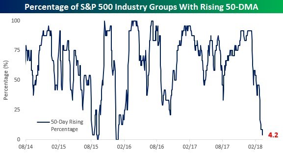
Almost All Sectors Are Falling
The chart below shows the percentage of S&P 500 sectors with rising 50 day moving averages. As you can see, 4.2% of sectors have rising 50 day moving averages because the utilities is the only sector with an increasing 50 day moving average. The two previous times in the past 4 years where all the sectors had declining 50 day moving averages were in 2015 and 2016. Many technicians don’t like when streaks of positive momentum end, but sometimes I think it’s necessary to wash all of the euphoria out of the market. I like to be bullish when everyone, including the technicians are bearish. Previously, I mentioned I wasn’t nervous about the S&P 500 breaking below the 200 day moving average because I have confidence in my fundamental outlook. There have been other times in this cycle where the 200 day moving average was broken without a bear market occurring. Sometimes technical analysis seems to drive equity performance in the short term, while other times new events, fundamentals, and public policy drive it. I’m open to whatever analysis works.
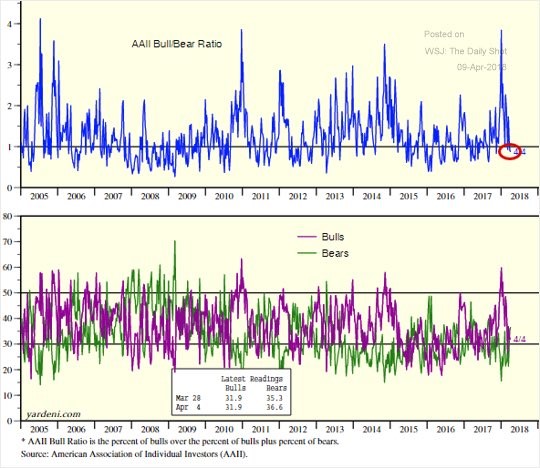
Bull To Bear Ratio Is A Contrarian Play
The final data I’ll review is the bull to bear ratio calculated by the American Association of Individual Investors. As you can see in the chart below, the optimism expressed in January was near the highest point in the past 13 years. The pessimism expressed as of April 4thwasn’t at an extreme level, but it’s progress to see all the positivity is gone. Investors who bought stocks just because they were going up are bearish now. More investors would like to admit are momentum traders. If you know what you own, you won’t be easily shaken out of your positions.
Conclusion
I’m not one to make portfolio decisions based on sentiment alone, but the excessive optimism in January was extremely disconcerting. The volatility in February and March wiped that away as investors are actually negative now. As I have said in previous articles, I don’t expect capitulation to occur because there’s not enough negative news to send the market into a crash that causes capitulation.