Stocks Rally
The jobs report was perfect as it sent stocks moving much higher. The Dow was up 441 points. The S&P 500 was up 1.74% and the Nasdaq was up 1.79% to a record high. The VIX fell 11.49% to 14.64. Oil was up 3.19% to $62.12 because of the optimism created by the jobs report. The dollar was flat as it closed the week at $90.12. The 10 year bond yield was up 3.7 basis points to 2.89%.
Best Jobs Report Since 2015
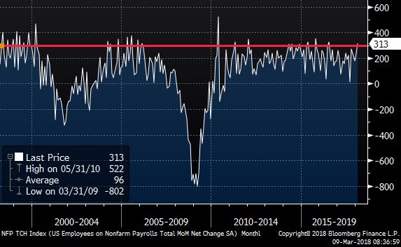
If I were to grade the report, it would get an A+ as all of the market needs were checked. The chart below shows the non-farm payrolls growth was 313,000 jobs. This was a huge beat compared to the consensus estimate of 205,000. Heading into the report, I expected 245,000 jobs created. That estimate was higher than the highest estimate on street, which was 230,000, but it was still below the result. This was the most jobs added since October 2015. The revisions were amazing too as January went from 200,000 to 239,000 and December went from 160,000 to 175,000. Even with all of those gains, the unemployment rate stayed at 4.1%.
Labor Market Isn’t As Full As Expected
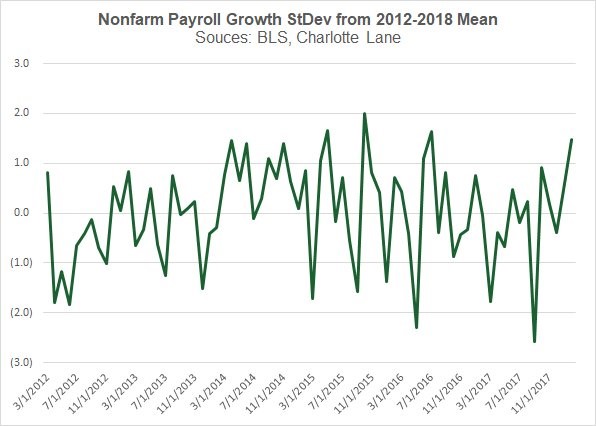
The chart below shows the size of the payrolls growth in terms of standard deviation. As you can see, the standard deviation was 1.5 above the mean from 2012 to 2018. Even though some may say this isn’t impressive, it is because the labor market is much fuller than it was a few years ago. This data changed economists’ preconceived notions on the labor market. That’s what tends to happen when expectations are beat. I noticed this was going to be a great report based on the employment reports from the regional Fed, the great ADP report, and the jobless claims reports. In my opinion, economists didn’t want to move their estimates higher because they thought the labor market was too full to deliver such a great result. They ignored reality which made them miss the result. Just like how a person needs cold water splashed on their face to awaken from a nap, economists need a shocking report to change the narrative.
Rate Of Change Terms
Some forecasters love to look at data in rate of change terms. I don’t think this analysis should be done on its own because there are many head fakes. A head fake is a term used in technical analysis which means the market moves one way and then reverses course for a long trend in the opposite direction. The correction in early February was probably a head fake as the bull market should continue for the rest of the year. If you realize the potential ways this analysis can be wrong, it’s fine to review.
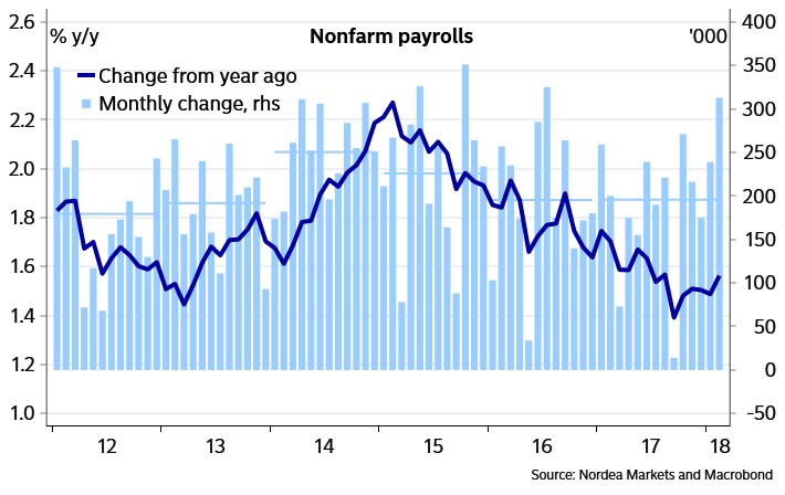
The chart below shows the year over change in non-farm monthly payrolls growth. As you can see, it has recently ticked up. There have been a few periods where it has ticked up in the past 2 years such as in mid-2016. However, it has been in a downtrend since early 2015. This is probably because the comparisons have gotten tougher to beat. The question is if this latest uptick is another head fake like the rebound in 2016. The good news is that the comparisons have eased. Ultimately, it will be a win if the growth rate stays the same or moves up. At the pace the growth rate was falling at in 2017, the total could’ve started shrinking in 2019. That’s a precursor to a recession. It might be a better indicator than the year over year change in the unemployment rate.
How Accurate Is The Unemployment Rate?
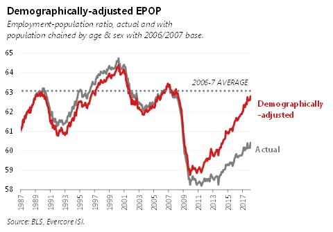
As I mentioned, the year over year change in the unemployment rate is used as a forecasting metric by Jeffrey Gundlach. It has had great success in previous cycles, but it might falter this cycle. As you can see from the chart below, the employment to population ratio hasn’t followed the unemployment rate. This jobs report finally made economists realize that the unemployment rate is flawed. I’ve known this for a while since the forecasts for wage growth were so wrong in 2017. I realized my mistake and corrected it, while some economists still haven’t realized the truth. This means the economy has longer to go before inflation picks up and eventually causes a recession. I think the unemployment rate will act weirdly in the next few quarters. Because there is still slack in the labor force, jobs growth will improve. However, the unemployment rate won’t fall much because new people will come off the sidelines back into the labor market. In this case, the rate of change in the total number of people working will be good, but the year over year change in the unemployment rate will make it look like a recession is coming.

The Most Important Category Improves
There are a few variables at play in the labor market. The increase in the number of jobs added can either improve wage growth or increase the number of total people working. The chart below shows the demographically adjusted employment to population ratio. It is adjusted by age and sex to remove the demographic impact. It shows that the labor market still has slack because the rate is below the 2006 to 2007 average. The employment to population ratio for ages 25-54 increased from 79% to 79.3% because many workers came from the sidelines. This decreases the slack in the labor market.
The reason why the market took this as good news is because it didn’t realize the slack existed. It will be pleased to realize there’s still millions of people who can come off the sidelines and into the labor force. If the employment population ratio for prime aged workers increases at that rate for the rest of the year, the labor market slack will cease to exist by the end of the year. While that sounds like scary news, I think the increase will slow down. Sometimes it increases quickly and then slows down. There were months in 2013 and 2014 where it increased 0.5%. In the past 3 years, the increase has averaged 0.63%, implying there’s about 2 years of strength left in the labor market.