2017 Was The Perfect Year?
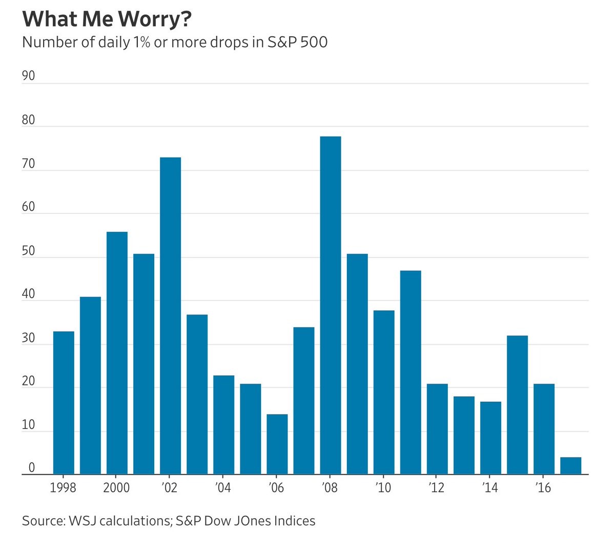
With bitcoin falling 45% from its peak in just a few days, stock investors are still sitting pretty as there have only been four 1% daily selloffs in the S&P 500. As you can se from the chart below, this is by far the lowest amount of daily 1% selloffs in the past 20 years. Even when stocks were at the end of their best rally ever in the 1990s, stocks were never this placid. This chart shows how each year can be different from the last year as volatility is far from permanent. In the past 30 years, there have been 1% selloffs every 7 or 8 days. Back in the fall of 2008, a 1% selloff was a nice day. In the past 3 decades, a 2% selloff has occurred 10 times a year on average, meaning there have been less 1% selloffs this year than there are usually 2% selloffs.
One of the questions traders have is if the algorithmic trading functions are creating smoothing. While that’s possible, it’s tough to think there has been that large of a difference between this year and 2015 which had 32 1% selloffs. The only way to tell for sure is to see how the next few years play out. Personally, I think that there are always predictions that the current market action will continue because of structural issues. Then we see a snapback to realty and those guesses prove to have been fruitless. It’s like how some questioned if unemployment could ever fall below 5% again when it was in the double digits a few years ago. Some people think that cryptos can’t go down. We have recently seen how ridiculous that notion is.
Very Low Unemployment In Some Cities
Measuring the unemployment rate in such a large country and then using it to make policy can be fruitless because of the sharp gradient among various regions. In America, some areas in the Midwest haven’t participated as much in the expansion. Another example of this is how Sicily hasn’t experienced the economic recovery that Italy and the rest of Europe have. As I mentioned, the unemployment rate has fallen significantly this business cycle as it’s now at 4.1%. The chart below shows the unemployment rates of some of the top American cities. As you can see, Boston, San Francisco, and Dallas have a 3% or lower unemployment rates. That’s probably very close to the minimum unemployment rate. The problem is that by the time Detroit starts to catch up, these cities see very high wage inflation. Detroit still has an unemployment rate of 9.6%. To be clear, not all areas in the Midwest are struggling. For example. Fargo, North Dakota has an unemployment rate of 1.6% because of the energy jobs. Indiana neared the lowest unemployment rate ever as it fell to 3% in June; now it’s at 3.9%.

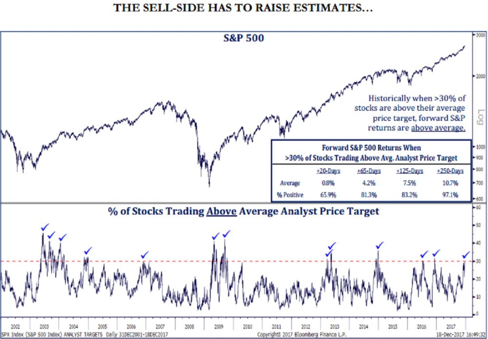
Stocks Rally Past Estimates
If earnings estimates are going to go up in 2018 to reflect the strong economy and tax cuts, stocks will rally before they go up. The chart below supports my point. As you can see, over 30% of stocks in the S&P 500 are trading above the 12 month price targets analysts have for them. The good news is that historically when over 30% of stocks are above their average price target, it is good news for near term returns. On average, stocks are up 10.7% in the next 250 trading days with a win rate of 97.1%. Therefore, there’s good reason to think the momentum in stocks will continue into 2018.
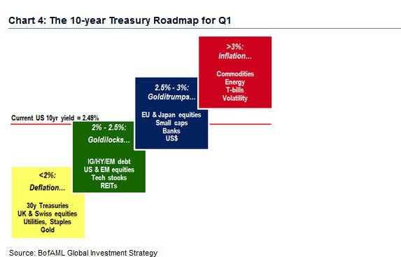
What’s Goldilocks
It’s obvious that 2017 was a Goldilocks year because stocks were up 19.82%. The question is how you define what a Goldilocks scenario is. Defining it is important because it will allow you to focus on which indicators will determine if the Goldilocks scenario continues. Clearly stocks can still go up if the Goldilocks scenario ends, but the outsized returns won’t continue. The slide below tries to summarize which scenarios are ideal based on the 10 year bond yield. It also shows which assets to own in each scenario. As you can see, the best 10 year bond yield is between 2.0% and 2.5%. It’s currently at 2.48% meaning the "Golditrumps" stage is coming up soon. As you can see, the best things to own in that scenario are EU equities, Japanese equities, small caps, banks, and the U.S. dollar. The banks have already rallied in anticipation of that scenario as they love the Fed rate hikes. The dollar hasn’t rallied. This implies it would be a great time to buy the dollar. When the 10 year gets to above 3%, the inflation stage starts. In that stage, it’s best to buy commodities, energy, T-bills, and volatility.
This is in tune with my outlook as I think the first burst of inflation in 2018 will be welcomed with open arms. It will mean accelerated wage growth is finally coming and the global economy is seeing accelerated growth. With the weakness in 2015 and 2016 in recent memory, investors would rather too much demand, than not enough demand. The critical point will be determining when inflation is too high. This is showing a 10 year bond yield of above 3% marks the point where inflation is too high. That would still be historically low, so there could be more runway. You’ll be able to tell by how the market reacts to inflation prints. If it beats estimates and stocks fall, you’ll know investors don’t want inflation anymore.
Conclusion
2017 was a special year. Arguably the Goldilocks moniker doesn’t do enough to describe it. There have been years with better performance, but the lack of volatility adds to the awesomeness. Stocks will likely go up in the "Golditrumps" market, but the situation will be more uncertain as inflation goes from a good thing to a bad thing. The start of the year should be filled with analysts increasing their targets, so it’s not time to go tactically short yet.