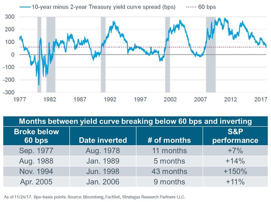
End Of The Yield Curve Flattening Period Treats Stocks Well
In continuation with our discussion about what the flattening yield curve means for stocks, the chart below shows the historical movements in the S&P 500 when the yield curve falls below 60 basis points. Firstly, you can see that the time it takes to invert once it goes below 60 basis points has varied widely. I have been discussing the possibility of it inverting sometime in late 2018 or early 2019, but that’s not close to a sure bet. As you can see, it took 43 months to invert after it went below 60 basis points in November 1994. Considering the fact that this is an elongated business cycle like the one in the 1990s, a delayed inversion wouldn’t be shocking.
The final column shows the S&P 500’s performance after the yield curve falls below 60 basis points. As you can see, the performance is mostly good. It’s important to annualize the performance because each length of time is different. The 1970s period had a 7.64% annualized return; the 1980s market had a 33.60% annualized gain; the 1990s period had a 41.86% gain; and the 2000s market had a 14.67% gain. The average annualized gain is 24.44% which is much higher than the average yearly gain overall. That doesn’t mean the next few quarters will have a big rally, but it’s worth noting the potential gains that could be had. Keep in mind, the median S&P 500 return in the past 6 flattening periods from 100 basis points to 0 was 6.6%.
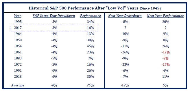
What Does The Low Volatility Mean?
As I showed in a previous article, the VIX is at unprecedented levels as it has stayed below 10 for way longer than ever before. Add in the fact that this is the longest stretch without a 3% correction ever and it’s safe to say this is one of the calmest markets ever. The obvious follow up question to that is what it means for next year’s returns. 2013 was relatively quiet and it was followed by a good year. The table below reviews the years with the smallest max drawdowns along with the performance the following year. As you can see, the years following the low volatility years were not great as the average max drawdown is -12% and the average return is 5%. In the following year, the volatility is near the average, but the performance is worse.
The good news is that the year with a slightly smaller max drawdown, which was 1995, was followed by a 20% gain in 1996. The speculation in bitcoin reminds me of the speculation in internet stocks in the late 1990s. The long period without a recession in the 1990s also reminds me of the current economy. I’m not saying that 2018 will bring a 20% gain, but I am saying that it’s possible. Even though the Fed has rates low, with a small spurt of inflation, they still won’t be hawkish. A healthy spurt of wage growth can be good as the business cycle comes closer to the end. We will find out if the extremely low volatility was catalyzed by the global central banks’ balance sheet expansion because the growth will slow in 2018.
Economic Forecasts
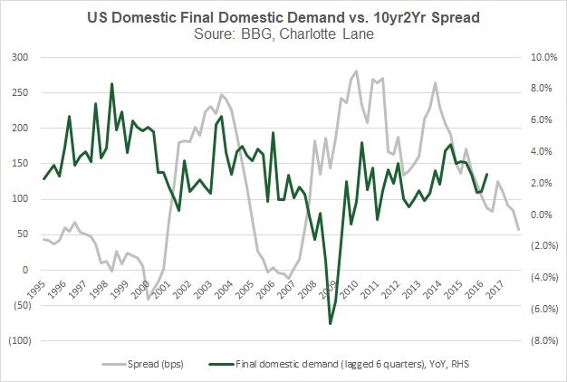
There are a variety of economic forecasts for 2018 as we are at the time of year where everyone is making a prediction. With so many predictions, it’s easy to lose sight of which ones were accurate. That’s partially why they are made. The chart below is one example of a prediction I disagree with. It shows the 10 year bond yield minus the two year bond yield as compared with the U.S. final domestic demand. The chart implies the final domestic demand is about to decelerate and potentially go negative. I don’t like this chart because it only shows two business cycles. If the yield curve stops flattening in the next few months, then there probably won’t be any deceleration in final domestic demand. The yield curve is only a good forecasting metric when it inverts. Until it does, it’s too early to make a forecast. This is like the CAPE in that the CAPE is only worth following when it is extremely high. When the yield curve is moderately positive and when the CAPE shows stocks are slightly more overvalued than average, they don’t mean anything.
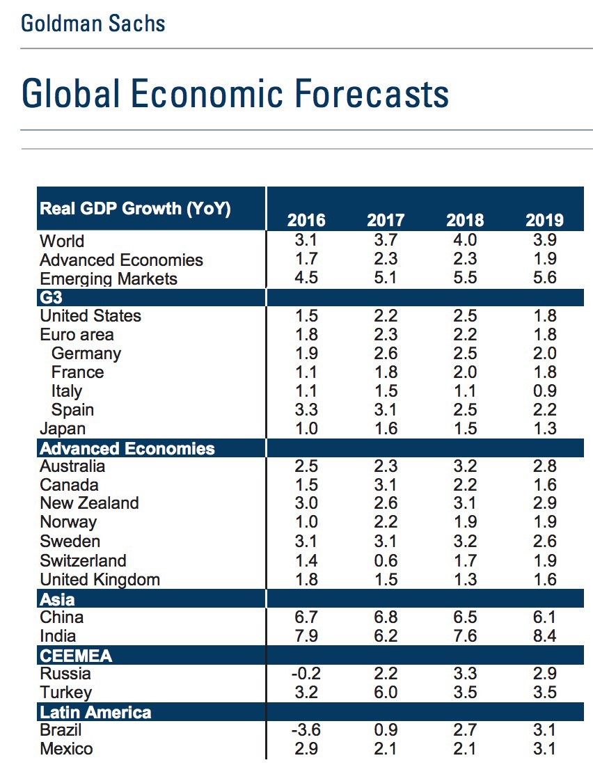
With that forecast which I disagree with in mind, let’s look at Goldman Sachs’ economic forecasts. Some are saying that 2018 will have the lowest number of countries in a recession ever. That makes it interesting to see where Goldman thinks each country is headed. As you can see, Goldman expects the global economy to accelerate from 3.7% growth to 4.0% growth in 2018. Italy is expected to take a big step back to 1.1% growth which could be problematic as it will need to deal with the ECB having less ability to prop it up. India is expected to have a big acceleration to 7.6% growth as the demonetization becomes less of a drag. Brazil is expected to further emerge from the depression it was in from 2015 to 2016. I think the expectation for U.S. GDP growth in 2017 is too low as the current Fed forecasts have the economy potentially growing at the fastest pace of this expansion. The Q3 GDP update on Wednesday will give us a lot more information on that. If the Q3 GDP estimate is pushed higher, the Goldman forecast will be too low.
Conclusion
Even though years seem like arbitrary dates, they aren’t because money managers make different decisions depending on the time of year. Money managers are now closing their books for the year and are trying to window dress to make themselves look good. That might be why Amazon stock is up 7.45% in the past month. Fund managers look bad if they don’t own Amazon stock. The next few weeks should be quiet as very few people are trading from the second half of December to the first week of January. The big announcement, which can cause volatility, is the GOP’s decision on the tax bill. That could make December more exciting than usual.