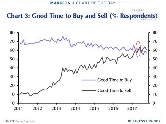
Houses Too Expensive?
This sentiment indicator for housing is interesting because it isn’t a contrarian indicator. Usually when you see investors euphoric about stocks, you want to sell. In this poll, the slightly over heated market is being met with skepticism. People in the housing market are much more rational than stock speculators. Although the housing market crashed in 2008 partially because of house flippers and speculators, that was an unusual situation. In the current market, you wouldn’t be able to get a mortgage on a home that was too expensive. When housing gets too expensive, people get priced out of the market. Housing is more like a retail good than a stock or bond investment. With all of that being said, it looks like housing is getting expensive as more people think it’s a good time to sell than think it’s a good time to buy. This might be because shelter inflation has exceeded wage inflation, making it tough for many people to afford homes.
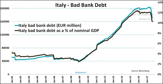
Italian Bad Debt
The chart below aims to show the amount of Italian bad debt is declining, but I find it remarkable to see how much it has been increasing for the past few years. Throughout the entire recovery until the past few months, this bad debt has been increasing. It’s now at about 10% of nominal GDP. I doubt it will decline back to what it was before the recession before another recession occurs. With the improvement, the ECB will have an easier time formulating a plan to recapitalize the banks and get the bad loans off their balance sheets. There probably needs to be more improvement to get the ball rolling. The other aspect in play is the March elections in Italy.
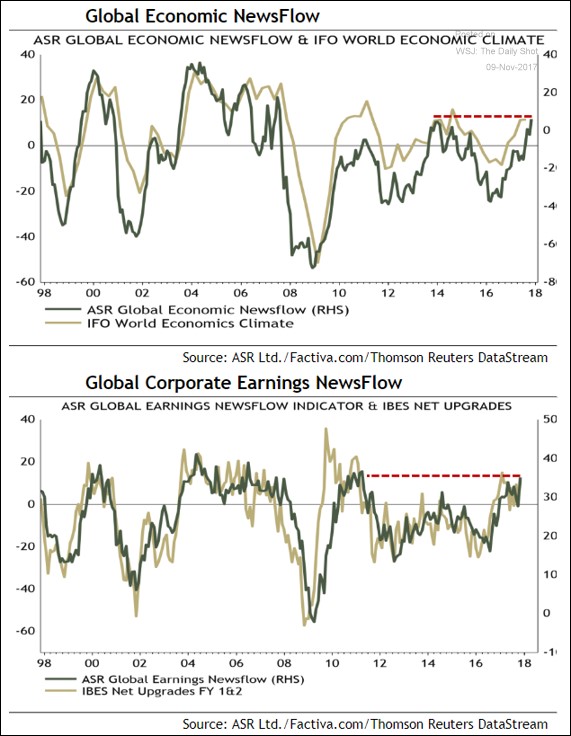
New Analysis Based On News Flow
The charts below are another example of new a type of analysis. These look much better than the Citi Surprise index which doesn’t have any correlation to how good the economy is doing. As you can see, the first chart shows the news flow about the global economy. When good headlines are prevalent, this index goes up. It seems to do a great job of showing how strong the economy is because its historic rating is in tune with other metrics we’ve looked at like the IFO world economic climate index. The second chart shows the net stock upgrades compared to the news flow about how earnings are doing. As you can see, both are correlated which also signals this is a good study. The earnings situation is the best since 2011. These charts aren’t forward looking, but I think they do a good job of explaining how the news flow represents the environment. You only see how good the economy and earnings are doing in the past when you read articles. They shouldn’t color your investing because you make money based on how the good or bad the future is.
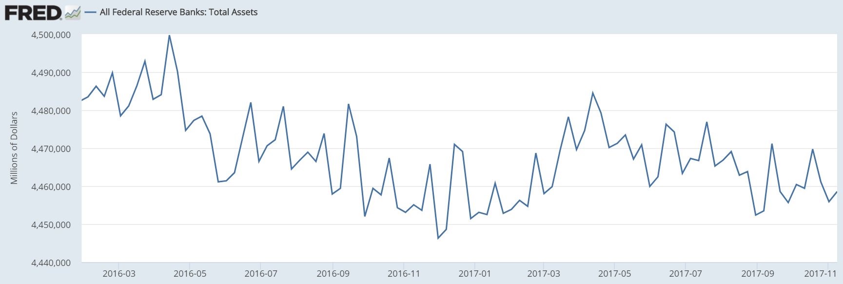
Fed Unwind
Last week many investors were discussing how the Fed’s balance sheet unwind started. It was a sharp drawdown. It was the first step in the process which should take a few years. The chart below shows that process did not continue this week. The balance sheet was $4.459 which is $2.7 billion more than last week. Last week there was a $5.2 billion decline. I talked about how the process would be lumpy in a previous article. However, it is interesting to see how slow the process is going. We want to see the initial effects of the unwind, but the unwind is so small there can’t be any conclusions made. There were bigger declines in the balance sheet before the unwind in 2016. We need more data points, which should come in the next few months, to see the effects of tightening.
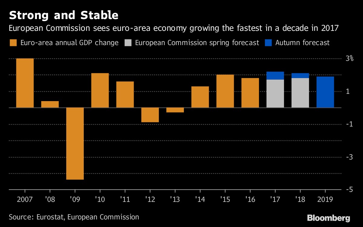
European Commission Is Very Optimistic
The chart below combines two of the topics we’ve discussed in this article. The fact that the European economy is growing so quickly helps explain why the Italian bad debt situation has improved. The expectations seen at the end of the chart disagree with my assessment that a recession will occur before the situation is sorted out since it shows the almost same growth rate occurring in 2018 and 2019. I don’t know why the European Commission bothers with these projections if it’s just going to extend the lines forward. I don’t think the ECB fully is on board with these estimates because it is cautiously continuing QE until the end of next year and raising rates afterwards. If growth were to stay near 2%, it would be the most consistent growth in years.
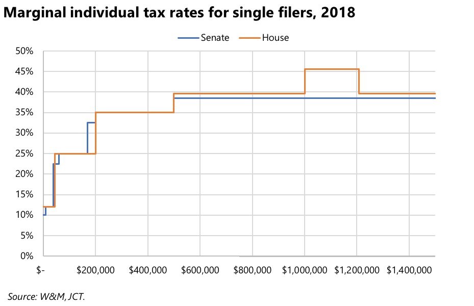
New Tax Code
The chart below shows the changes to the tax code in the Senate and the House plans. In a previous article, I discussed the differences between the plans. This chart is a great visualization of the rates. The House plan has higher rates because it keeps some of the deductions for state and local taxes. The discussion of ideological differences gets the most coverage, but the details of the plan will be what’s important. It’s not easy to change the rules and the rates while ‘hurting’ the right people (the rich) and ‘helping’ the right people (the middle class). It would be a disaster for the plan to raise taxes for upper middle income people. The fact that it might, shows how complicated it is. The big problem is that getting rid of state and local deductions is the only way the plan works, but this elimination hurts people differently because every state has different tax rates.
Conclusion
The stock market barley fell when the possibility of the tax cut being pushed back a year was discussed. This is a big deal, but big trades can’t be made based on this news because it might not make it into the final bill and because the bill might never become law. We could be in another situation where the monetary policy has more of an effect on the economy than fiscal policy. The weird part is that both are headed in the opposite direction as Republicans want a stimulus while the Fed is reining in stimulus. That’s the problem with fiscal policy. It operates according to elections instead of the business cycle.