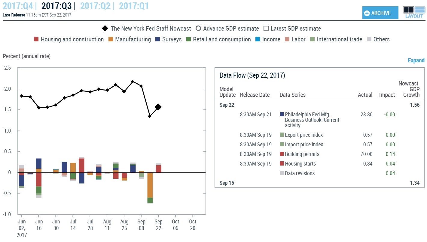
Q3 GDP Will Be Impacted By The Storms
The chart below shows the NY Fed’s GDP Now estimate for Q3. It’s been consistently the most negative forecast out of any I follow. As you can see, it’s estimate improved 0.22% from last week mainly because of the lift from the building permits data. The current estimate for Q4 GDP growth is 2.01%. The current St. Louis Fed forecast is for 2.78% growth. The only way I see that happening is if growth improves from the rebuilding efforts at the end of September.
High Sales Multiples Aren’t A Negative Catalyst
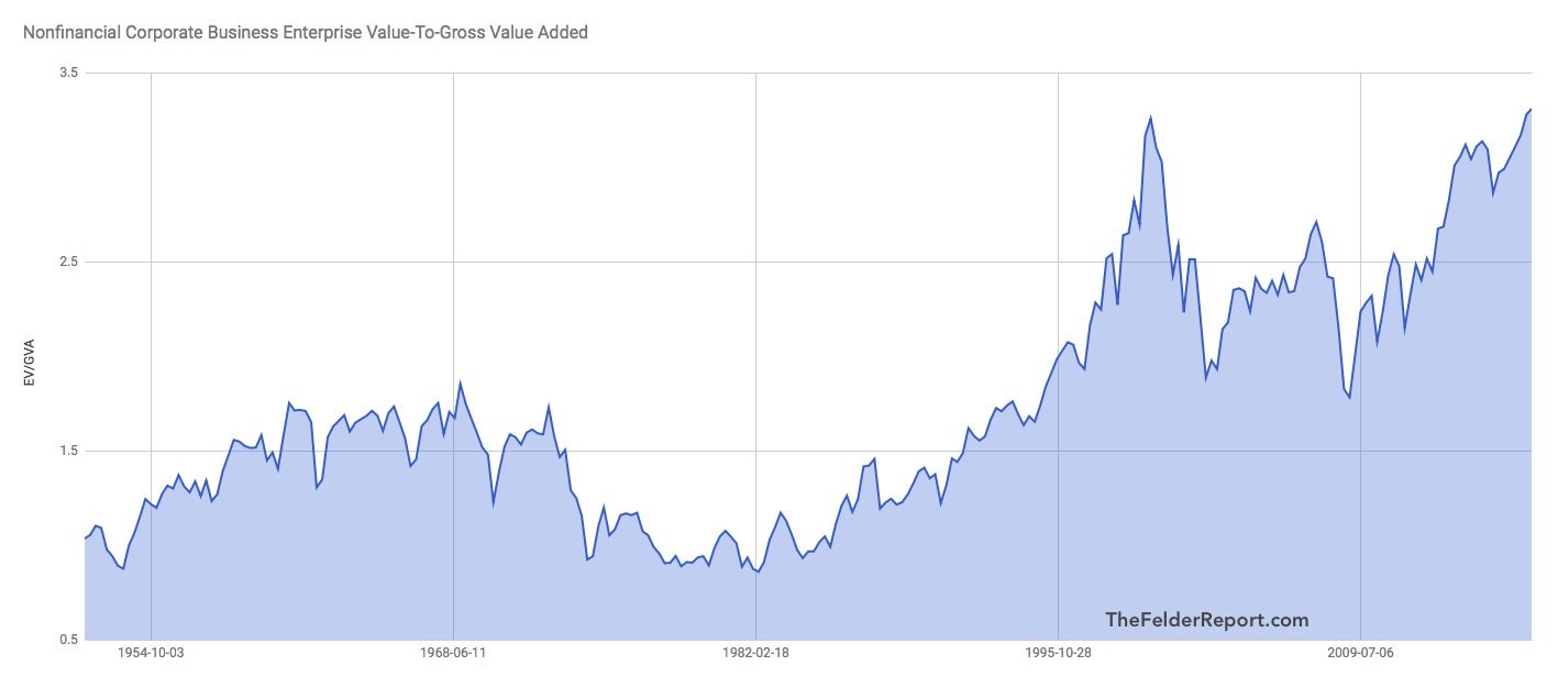
The chart which shows the corporate business enterprise value to gross value added is back in the discussions among the bearish macro investors because it recently hit a new record high. I have been of the belief that the stock market overall is more expensive than average for the past couple years. The problem is that information is meaningless unless there’s a change in the business cycle. The other possibility, which is being promoted by this chart, is that valuations have gotten so extreme that valuation can be a catalyst in itself. Valuation isn’t usually thought of as a catalyst; instead people think of it as a long term guide for expected returns. If a market is in an extreme bubble like during the early 2000s with technology stocks, then stocks fall just because the market runs out of buyers and traders want to take profits. Does there need to be a catalyst for a money losing business to stop trading at nosebleed levels? No there doesn’t.
The crux of the ‘valuation is a catalyst’ argument is that stocks have gotten to insane levels. The reality is the stock market has been led by record profits which make it so that earnings multiples aren’t at record levels. The chart below is a price to sales ratio. That doesn’t take into account high profit margins. It’s a fair point to say margins aren’t sustainable, but they need to fall before you say this is the most expensive market ever. Median valuations are high and stocks are more expensive than they were in 2007, but we haven’t yet reached the nosebleed level shown below. While valuation being a catalyst isn’t a threshold that has been met, there are concerns that over the long run stocks won’t have outstanding returns. That’s not a flashy opinion which generates clicks, but I think it’s the most rational perspective.
Debt Ratios Contorted To Look Bad
The chart below is a double whammy for the bearish argument on stocks because it’s a bad argument. It shows the debt to sales ratio. Looking at sales makes little sense because you can’t pay back debt with revenues; you can only pay it back with profits. While you may think that this change would only make things look worse because profits are harder to come by than sales, you must realize we are looking at these metrics in relative terms. Therefore, the higher margins would make this chart look better. It’s also worth noting that this chart, faulty as it is, hasn’t made any accurate predictions in the past few decades.
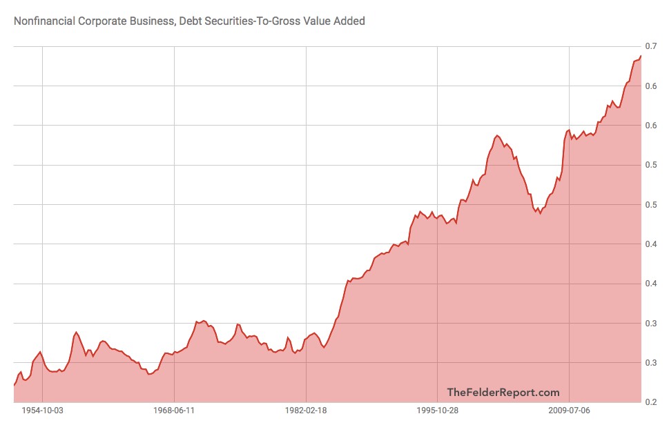
As you can see from the chart below, debt has doubled since 2004 and so have profits. Financing costs have been lowered which helps profitability which implies that rising corporate interest rates is the only way debt will become a problem. The ratio of debt to sales compared to equity to sales is 4 to 1 which is the long term average. This implies that the debt issue isn’t an imminent threat. If profits were to fall, there would be a problem, but there’s always a problem when profits fall; that’s not a unique point.
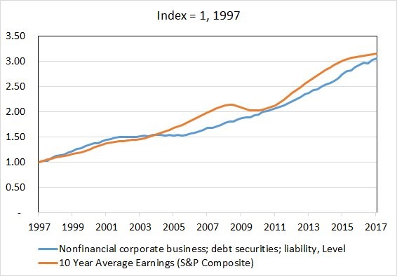
Because profits have grown along with debt, there hasn’t been a debt for equity swap which is causing the increase in buybacks. Because equity financing is relatively expensive compared to debt, there has been an increase in buybacks, but they’ve been fueled by profits. Only when companies are borrowing money to buyback stocks are companies engaging in a debt for equity swap. Companies are engaging in smart behavior by using debt financing instead of equity financing. The chart below shows the historical relative cost of both debt and equity, showing how relatively cheap it is to issue new debt. The blue line is a misnomer like the red bar chart above. It’s disingenuous to show the increase in debt on its own because the debt will always increase if corporations are growing.
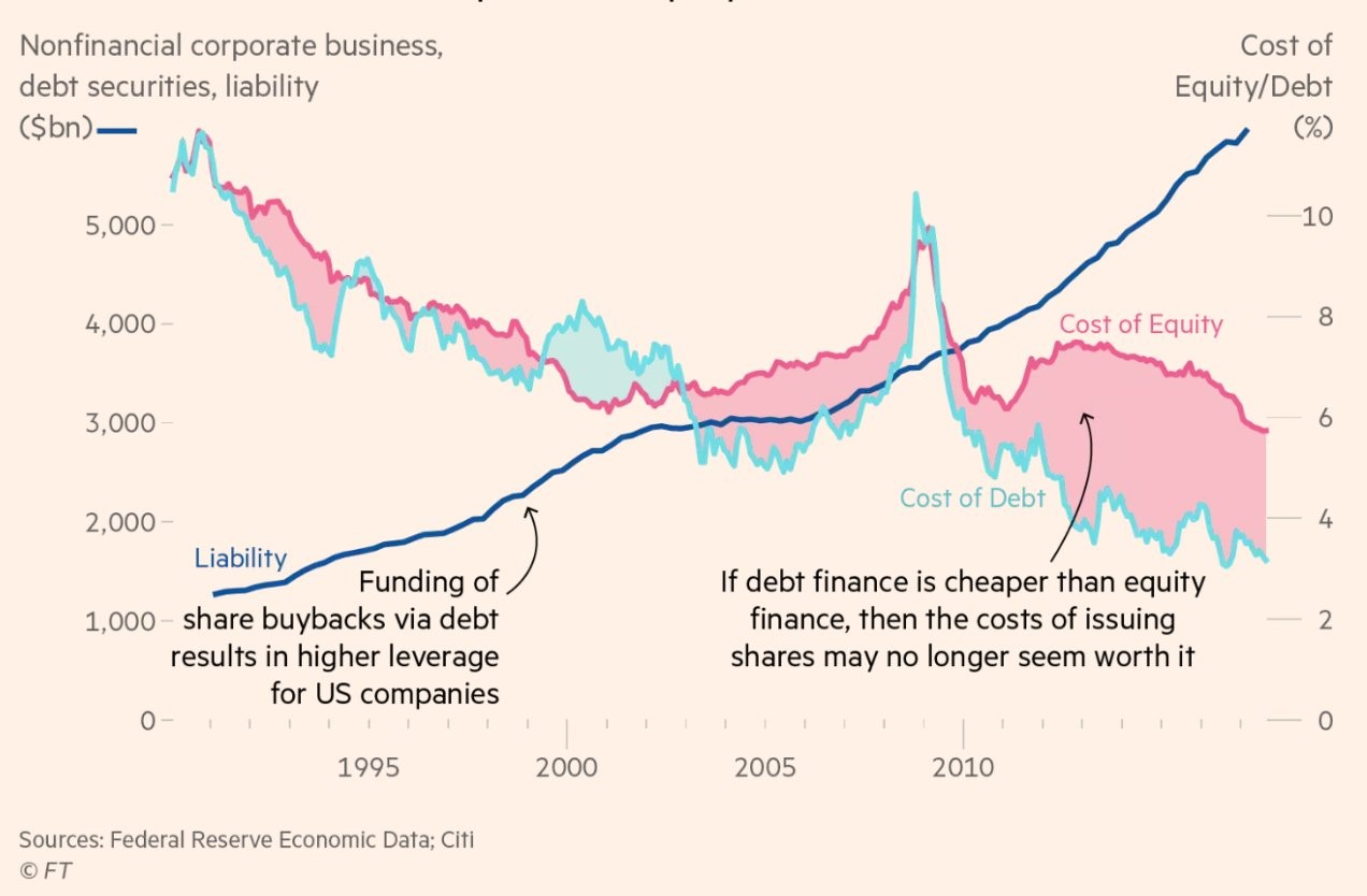
The big question that should be on the minds of investors is what the trends in financing will be in the future. Financing costs have been declining for the past 20 years. If both rise, it would be bad for profit margins. The worst thing for stocks would be if equity financing costs rise faster than debt financing because that would mean the supply of equity would increase as companies would be more focused on paying back their debt than buying back shares. The best balance sheets aren’t always the ones with the least amount of debt, sometimes leverage helps amplify returns. We’re in a world where taking out debt to fund growth makes sense as long as the returns are decent. If the cost of debt rises, having less debt would make more sense. The key is to have flexibility so you can have an optimal debt to equity ratio in all environments.
Conclusion
The bearish argument that stocks are more expensive than the tech bubble holds no water if you look at profits. That means valuation isn’t a catalyst for selloffs. The high corporate debt levels look disconcerting if you contort them to fuel an agenda, but when compared to profit growth, debt isn’t extraordinary. Companies are mostly funding buybacks and dividends through profits, so they aren’t using leverage to push valuations higher. Buybacks plus dividends are equal to 88.4% of operating earnings; this nullifies the implication that the stock market is built on leverage