Predicting economic cycles is difficult. This cycle has been especially tough because of central bank interventionism, the fact that the recession was worse than any other one since the Great Depression, and that the recovery has been weak. All those three points mean the recovery will be longer than usual. QE and low interest rates helped stimulate the economy, pushing stocks up. The fact that the recession was bad implied the recovery would be strong. That hasn’t happened, but instead it has been long as this is one of the longest bull markets ever. The lower the growth, the less risk for the economy producing high inflation causing the Fed to hike rates and plunge the economy into a recession.
The chart below attempts to do a cyclical analysis of the economy. As you can see, the blue is the downturn right before the recession, the green is the repair during the recession which is the deleveraging, the red line is the economic recovery, and the yellow is the expansion where the credit market loosens and multiples expand. The chart shows during the mid-cycle slowdown, there was a short time where it looked like the economy was in a downturn, but that quickly ended. There were two larger false signals in the 1990s recovery which could have caused investors to miss out on the gains. The two key changes to follow are going from yellow to blue and going from green to red because they represent the changes in the cycle you want to time. This chart indicates the economy is not near a recession which isn’t surprising based on the economic data we’ve looked at.
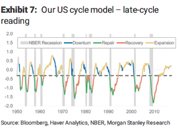
The title of the chart above shows we are late in the cycle even though it shows the economy is in expansion mode. I think Morgan Stanley wants to say the economy is late in the cycle because of how old the recovery is. I think the economy was late-cycle in 2016, but the facts have changed with the improved metrics. Many prognosticators said the 2016 economic recovery was in the 9th inning (baseball game with 9 innings). Their cop out was this game can go to extra innings. It certainly has as the growth has re-accelerated.
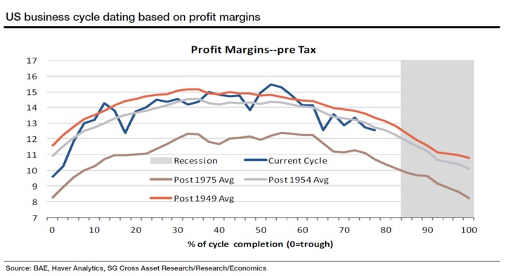
The chart below shows the typical profit margin cycle. This chart runs counter to the information I look at from S&P Dow Jones which shows in Q2 2017 the S&P 500 had record profit margins of 10.22%. If you believe the information in the chart below, it would indicate that there will be a recession next year since the peak is already in and it’s near the grey recessionary bar. If you use the information from either FactSet or S&P Dow Jones and say the S&P 500 profit is at its peak, then the economy is still in the middle of the cycle. The reason for the divergence in that information from the chart below is that the chart below doesn’t only look at the S&P 500. Small cap firms have seen their margins peak.
If you trust the small caps, then the economy is near a recession; if you trust the large caps, we are a few years away from a recession. Typically, small businesses create about 2/3rds of the jobs in the economy. We could be entering a new phase in the economy where large corporations have more of an impact than they have historically. That could be a result of high regulations and central bank interventionism. Central banks invest in large cap debt and equity, leaving the small caps to whither. This would be a terrible long-term trend because small businesses are the bastions of innovation. However, this is great for the short-term because it means we aren’t near a recession as large caps are firing on all cylinders.
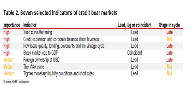
The chart below looks at credit indicators to determine where we are in the credit cycle. I think saying we are in the late cycle of the yield curve flattening is wrong because the yield curve is still not inverted. Usually it inverts and then steepens for a few quarters before we have a recession. This chart gives you an idea of where HSBC sees the economy, but I maintain that we are in the middle of the cycle now.
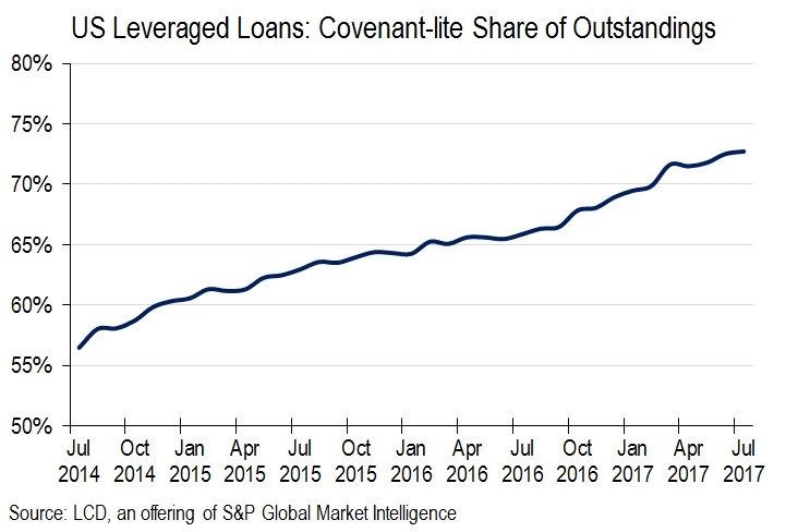
The chart below is an alternative way to view the credit market. It shows the percentage of U.S. leveraged loans which are covenant lite. Cov-lite loans have little requirements for borrowers. The percentage increasing indicates to me that we are in a ‘risk on’ scenario where investors are willing to put caution to the wind and lend money to borrowers without getting information on the company to gain a few extra basis points in yield. One obvious point to keep in mind is the percentage is capped at 100%, so eventually it will slow its rate of increase. This is a new trend as cov-lite loans have never been issued at this scale. That means there’s no other cycle to compare it to. That doesn’t mean it’s not a viable indicator. This is a new cycle with different rules. Don’t get me wrong; I think this practice will end in disaster. The point is that as long as this percentage is increasing, it implies the party is still going.
Conclusion
We looked at some of the indicators which show the point we are at in the credit cycle. I disagree with any perspective which indicates the credit cycle is near it’s end because we are seeing aggressive action in the junk bond market and cov-lite loans. If you consider an over-heated market to signal an end in the credit cycle, then I’d agree with it being near the end. However, I need to see negative economic activity and the ‘risk off’ trade gaining steam before anticipating a recession. That might mean you don’t sell stocks at the exact top, but is there anyone who can predict the exact day the bull market will peak? There’s nothing wrong with selling after stocks fall 5%. I’m not looking for a falling stock market to predict a top, but I’d expect there would be a minor selloff if economic activity began to weaken.