U.S. Versus The World
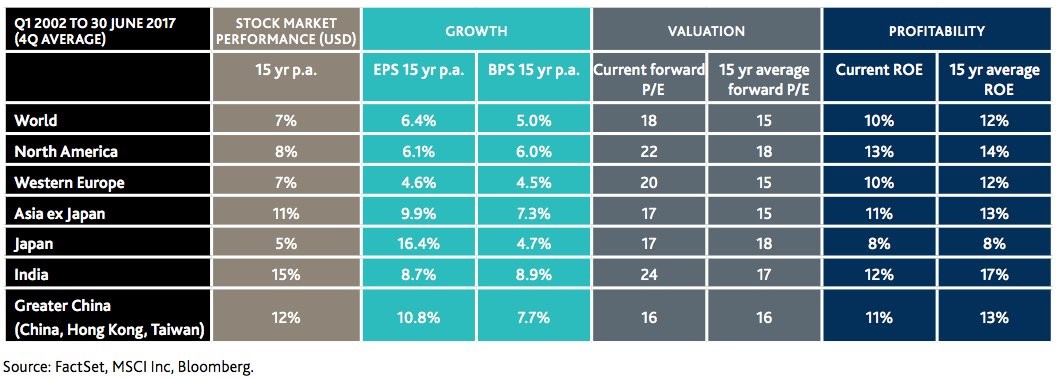
With the stock market reaching another record high let’s look at valuations across the globe. As you can see from the chart below, North America has the second highest current P/E ratio and the highest forward P/E ratio. North America has a relatively low 15-year earnings growth rate and book value growth rate which doesn’t justify the high P/Es. The one bright side is that North America has the highest return on equity and the second highest 15-year return on equity average. Despite this expensive valuation, America has a relatively meager 15-year average return on stocks as the over 50% drop in the financial crisis hurt gains.
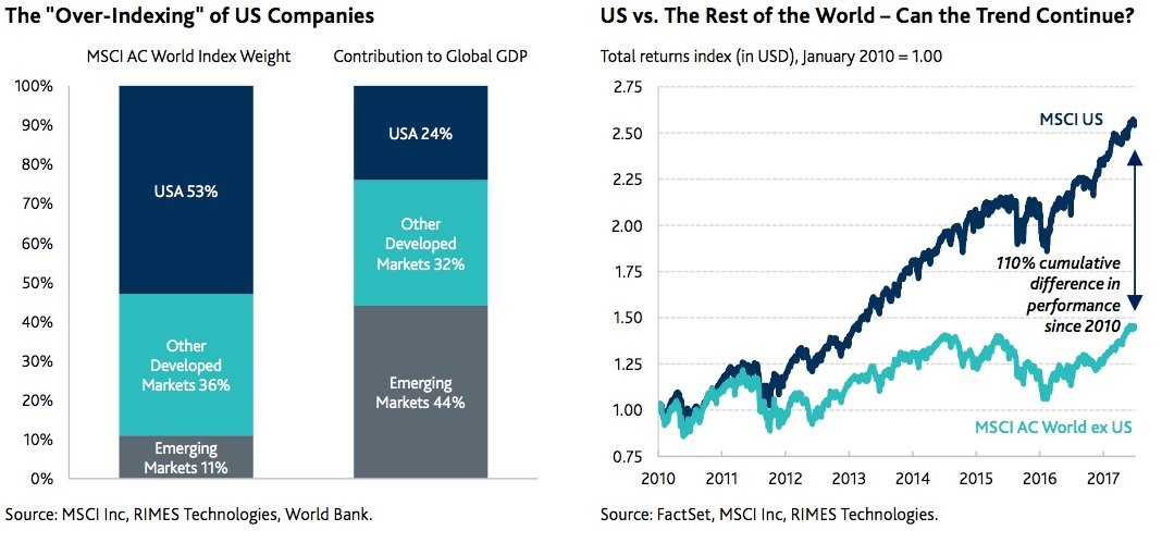
While North America has had meager 15-year returns, in the past few years the U.S. has outperformed the world average as emerging markets have underperformed. The chart on the right shows the MSCI global index with and without the U.S. There is a 110% outperformance showing how much of an impact America has had on global stocks. The chart on the left explains the result of America’s outperformance as it now has a 53% weighting in the MSCI world index despite its 24% contribution to global GDP. The misleading part of that chart is that American companies get 30% of their sales from abroad. Therefore, if you multiply the 53% weight by .7 you get the actual weight the American economy has. That gives a 37.1% weighting.
37.1% is still higher than 24%, meaning it is still over-indexed. This happens anytime a stock or a group of stocks does well. Apple for example, is in growth and value indexes because it is successful. This indexing leads to accelerated forced selling when the trend reverses. The question is if the U.S. will lead to a selloff abroad. The most likely way for a rebalancing might be if after the selloff is done, the emerging markets begin to outperform. It’s not that simple because Brazil has political instability and China is in a credit bubble. As you can glean, a credit bubble artificially inflates GDP growth which distorts the comparison to the index. For example, America’s stock market might not be overweighted, but instead the Chinese economy might be overweighted in the measurement of its contribution to global GDP.
Some Bullish Figures
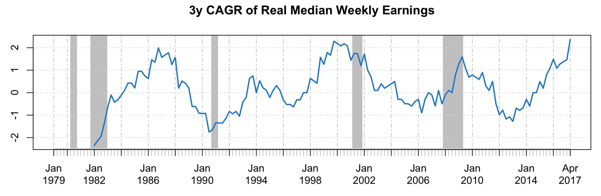
The chart below shows the most optimistic chart I’ve ever seen on median weekly earnings. I’m skeptical that the 3-year time frame was selected to make it look good. Either way, the 3-year compound annual growth rate is the highest since at least 1982. It jives with the 8.3% year over year growth in tax withholdings in June. Along with posting this chart a bullish investor claimed Volcker would have raised rates, meaning Yellen is very dovish. While I wouldn’t disagree that Yellen is dovish, the claim that rates should be increased based on wage growth ignores the low inflation rate. If you’re of the belief that the economy overheats, then you might be worried by great results. I’m never worried by great economic results as this median income increase hasn’t caused inflation; it would be silly to operate under the conclusion that it is.
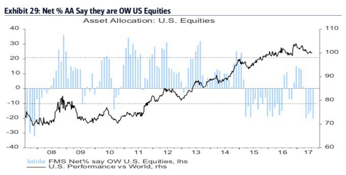
I put the chart below under the bullish category because the fact that the highest percentage of fund managers are bearish on stocks since January 2008 is being described as a contrarian indicator to go long stocks. This survey supports the notion that this is a ‘hated bear market.’ I disagree that this is a contrarian buy indicator because going long stocks is clearly a consensus trade given the outperformance this year. It’s also worth noting that the fund managers were right to be bearish on U.S. equities in January 2008. Keep in mind the chart shows the American stock market’s performance versus the world. Fund managers were too bearish in 2015, early 2016, and the last few months. In the latest survey, a net 80% of fund managers thought the U.S. was the most overvalued region. They must be looking at the charts I highlighted in the beginning of this article.
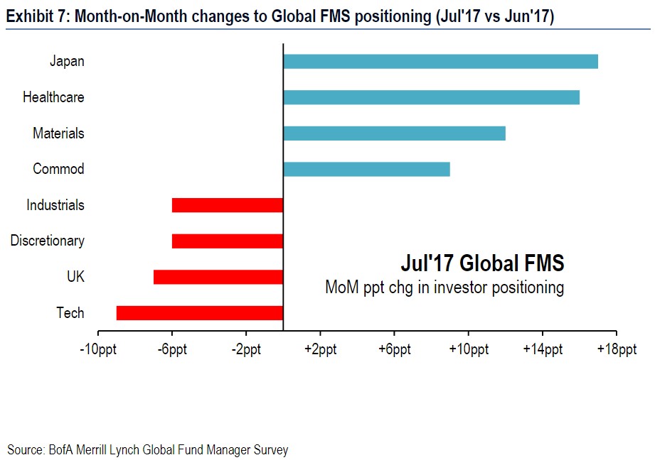
Fund Managers Selling Tech?
The chart below shows the month to month positioning by fund managers. They have been moving capital to Japan, healthcare, materials, and commodities and taking money out of industrials, discretionary, the U.K., and technology. This shift in the technology positioning must reflect the selloff in tech a few weeks ago because the Nasdaq just hit a new record high today as the selloff ended just as I said it would. The survey was done from July 7th to the 13th. Since July 7th, the Nasdaq is up 3.77%. Either these investors got burned or they changed their positioning quickly. To be fair, this survey did predict the selloff in tech as the Nasdaq fell 3.67% from mid-June to mid-July. However, calling the Nasdaq the most crowded trade only to see it have a temporary small selloff before rocketing even higher isn’t exactly a win.
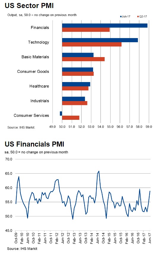
Not only were fund managers bearish on tech, they were also bullish on financials. There’s that small group that said they think the Fed’s unwind would be bullish for banks. Regardless of that spurious notion, the fund managers have the Markit PMI on their side supporting the long financials trade. As you can see from the top chart, financials have the highest PMI in June. Tech has the second highest PMI which throws cold water on the bearish tech trade. The bottom chart shows how this latest improvement in the financials PMI has been sudden.
Conclusion
The U.S.’s weighting is too high in the MSCI index even if you account for the international sales. North America also has a very high PEG compared to the other regions. Using this information, fund managers are making bearish bets on America. That isn’t working out as the Nasdaq and S&P 500 just hit a record high. I am skeptical of the concept that the banks will rally when the Fed starts to unwind its balance sheet. We will see what happens in 2-4 months.