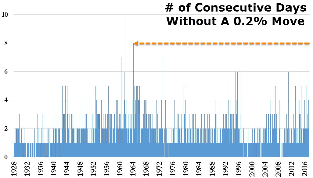
The S&P 500 reached a new all-time closing high on Friday. It’s notable how tight of a range stocks have been in recently. There’s been 8 consecutive days without a 0.2% move in stocks. As you can see from the chart below, that’s the longest streak since 1964. The all-time longest streak is 10 days, so it seems highly likely that next week will see more volatility than this week. This VIX may break the 10 handle it has been glued to which is a historically low price.
One interesting discussion that has been going on in bullish circles is that GDP growth doesn’t matter anymore because it doesn’t reflect the innovation in the economy. The narrative goes on to discuss how great corporate earnings and the labor market are doing. There are certain problems with GDP which is why, like all metrics, I take it within the context of all the other reports. The reason this new narrative is likely propping up is because GDP growth is the most obvious sore spot among economic data. The Citi Economic Surprise index is at -18.20, so the data isn’t that strong. Just because earnings and the labor market aren’t matching up with GDP doesn’t mean it’s completely off base. Many other indicators within the surprise index are clearly disappointing expectations.
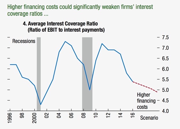
Another reason bullish investors have found GDP to be the enemy is because GDP is used in most valuation metrics which show the stock market is expensive. However, my counter to this claim is that the stock market is expensive regardless of whether you include GDP in the denominator. The current Shiller PE is at 29.48 which is nearly double the median Shiller PE which is 16.12. There is certainly no ceiling stocks can’t jump past in relation to GDP because when buying an individual firm, you look at the future cash flows, not GDP. GDP is more of a goal post which to measure certain things. It’s better to look at GDP as a goal post than to compare metrics on an absolute basis since metrics are always increasing. The corporate debt level is still high even if you don’t use GDP as a goal post. The chart below shows how interest coverage ratios are near the trough of the financial crisis. GDP is simply a goal post. The bulls don’t have a leg to stand on with regards to valuation or leverage, so they attack the goal post.
Speaking of GDP expectations, the Atlanta Fed is way out in left field with estimated Q2 growth of 4.2%. I can’t say this growth rate would be impossible because the data hasn’t come in yet, but it would be shocking. There has been a role reversal as now the NY Fed’s model is the bearish one as it is only projecting 1.8% growth. The ISM manufacturing report and import/export data pushed its expectations lower by 0.5%.
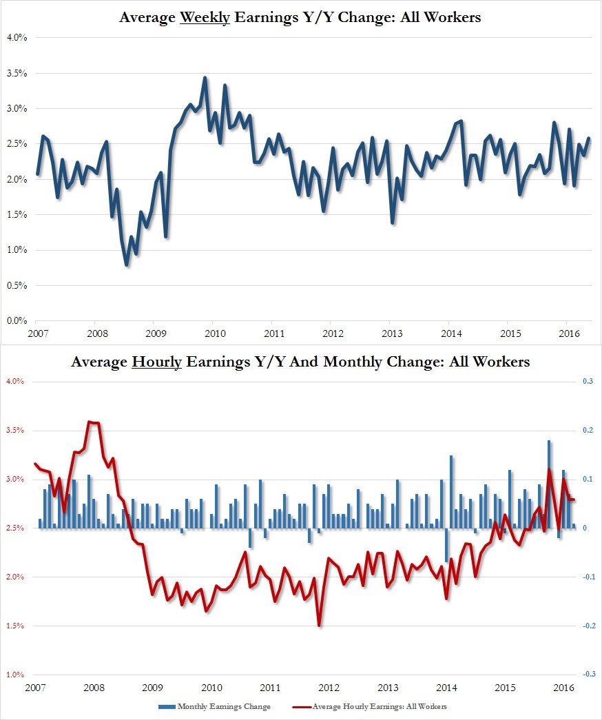
I have one more point that I didn’t make in the last article on the April BLS non-farm payrolls report. The average weekly hours worked increased from 34.3 to 34.4. Weekly hours worked affects hourly earnings growth because it’s tough for businesses to higher people to work more hours for higher pay. In the end, take home pay is a more important gauge than pay per hour. If workers spend more time working, than they have more money in their pockets regardless of wages. There’s a limit to the hours worked, so it can’t drive growth in pay forever, but it did so in this report. As you can see from the chart below, the average weekly take home pay growth on a year over year basis was 2.6%. Average hourly earnings growth hasn’t come close to the previous cycle’s high, but the weekly earnings growth paints a brighter picture.
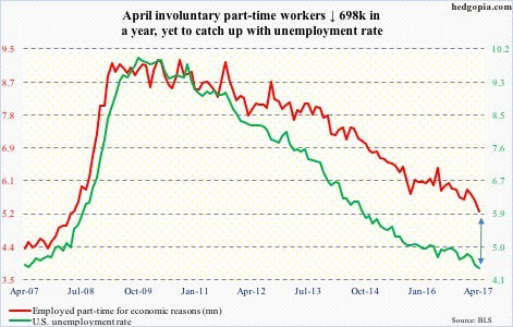
I’ve been discussing the slack in the labor market to determine when the hourly wage growth will come in which will encourage the Fed to raise rates and hurt corporate profit margins. The chart below shows the slack in the labor market clearly as those involuntarily working part-time represent additional workers who can enter the full-time labor force. There was a 698,000 drop in part-time workers seeking full-time employment. The drop in those employed part-time for economic reasons shows the slack in the labor market is shrinking.
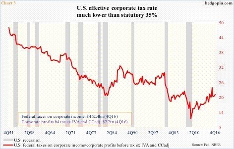
I have discussed the effect corporate tax cuts will have on the stock market previously. This chart below gives a historical picture of the previous effective corporate tax rates. As I have mentioned before, corporate taxes paid as percentage of GDP is on the low end of the historical spectrum. The effective corporate tax rate has been in decline for decades. It’s important to note that the tax rate paid is much below the 35% statutory rate. If the rate is lowered to 20% and some loopholes are closed, the effective tax rate will probably be in the high teens, meaning corporate earnings won’t get that big of a boost. The most important takeaway from this chart is that this tax cut will likely be the last hoorah for corporate tax cuts. The orange has been squeezed. The last drops are coming out in this latest tax reform plan.
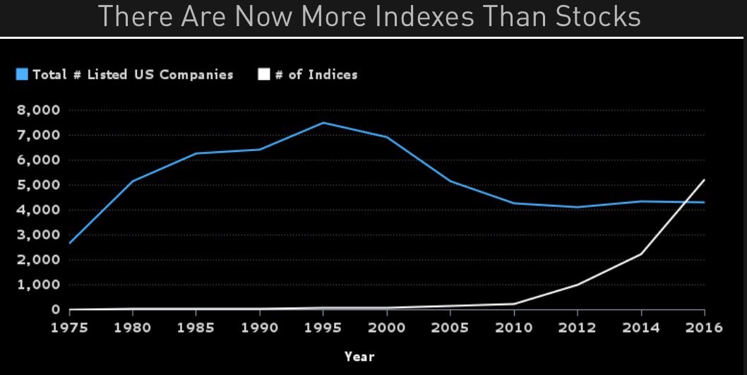
I have discussed the bubble in index funds before. Those who review their portfolio the least have been the most handsomely rewarded in the past 8 years. Investors who simply bought the S&P 500 index fund every quarter and paid no attention to it have done well. They didn’t even have to buy the dip. Buying at any time worked fine. The chart below shows this bubble in a unique way. It shows the total stock market listings compared to the number of indices. You’d expect the number of stocks to be way more than the number of indices because each index has many stocks in it. However, with the number indices has surpassed the number of stocks as index fund investing has proliferated. I predict that this trend will swing in the opposite direction in the next few years. Passive management will have weak performance because stocks are expensive and the economy is overleveraged.